Effective dashboard design improves UX by carefully managing trade-offs.
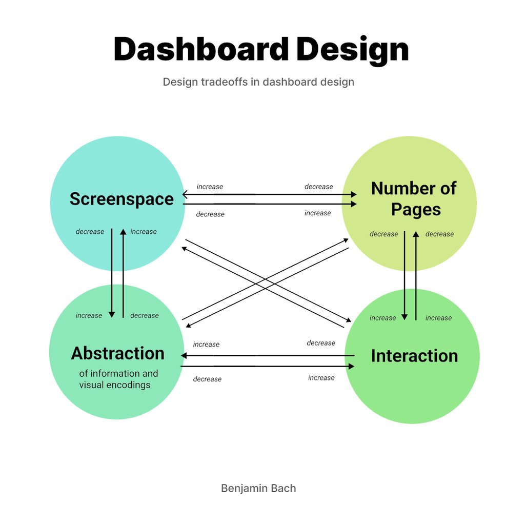
We love Benjamin Bach’s article on the inevitable design tradeoffs in dashboard creation. He focuses on four key parameters: screenspace, the number of pages, data abstraction, and interactivity.
Balancing these parameters requires careful consideration, as optimizing one often stresses the others. The goal is to minimize stress by finding an optimal balance, which involves making informed decisions about which parameters to adjust based on the specific context and requirements of the dashboard.
A well-crafted dashboard design can help you make data-driven decisions efficiently. This post will walk you through the key principles and best practices of dashboard design, focusing on screenspace, the number of pages, data abstraction, and interactivity. By the end, you’ll have a clear understanding of how to balance these elements to create an effective and user-friendly dashboard using Helio testing.
Launching a dashboard without rigorous testing is like setting sail without a map.


Basic Dashboard Design Ideas
A dashboard is a visual representation of data that helps users understand, analyze, and decide based on that information. Its primary goal is to present complex data in an accessible, easy-to-understand format. To achieve this, a good dashboard design must balance several key parameters: screenspace, the number of pages, data abstraction, and interactivity.
Screenspace Management Howtos
Screenspace is the amount of visual real estate available on a dashboard. Effective use of screenspace ensures that information is accessible without overwhelming the user. Managing screenspace effectively is crucial for creating functional and visually appealing dashboards. Here are some tips for managing screenspace:
- Prioritize Essential Information Display the most critical data prominently. Users should be able to see the most important metrics at a glance without having to search for them. This can be achieved by placing key performance indicators (KPIs) at the top of the dashboard or in other highly visible areas.
- Avoid Clutter Too much information can be overwhelming. Use whitespace effectively to improve readability and prevent the dashboard from looking too busy. Whitespace helps to separate different sections of the dashboard and makes it easier for users to focus on individual data points.
- Use Visual Hierarchy Arrange elements to guide the user’s eye to the most important information first. Use size, color, and placement to create a visual hierarchy that directs attention to key areas. For example, larger fonts and bold colors can be used for headings and critical data points, while less important information can be displayed in smaller and subtler colors.
- Examples of Good Screenspace Usage Consider a business dashboard design highlighting KPIs at the top, with detailed metrics below. This layout ensures that critical information is visible immediately while additional details are accessible without cluttering the main view. Another example is using a grid layout to organize data logically, making it easier for users to scan and find relevant information quickly.
Helio testing for dashboard screenspace
Gather feedback on different layout designs to determine the most effective use of screen space. User testing can reveal which layouts maximize readability and accessibility. Here’s how you can use Helio to enhance your screen management:
- Prototype Testing Create prototypes of different dashboard layouts and use Helio to conduct user tests. Collect feedback on which layout users find most intuitive and easy to navigate. Helio’s visual feedback tools can help you see exactly where users are focusing and how they interact with different elements on the dashboard.
- Heatmaps Use Helio’s heatmap feature to analyze user interaction with your dashboard. Heatmaps can show you which areas of the screen users are paying the most attention to and which areas are being ignored. This information is invaluable for optimizing screenspace and ensuring that critical information is prominently displayed.
Additionally,
- A/B Testing Conduct A/B tests using Helio to compare different dashboard designs. By testing two versions of your dashboard, you can determine which design is more effective in terms of user engagement and readability. This helps you make data-driven decisions about layout and screenspace management.
- First-Click Tests Use first-click tests to assess how easily users can find important information on your dashboard. Helio can help you track the first click a user makes, providing insights into whether your visual hierarchy is effective and if users can quickly access the data they need.
- User Surveys Collect qualitative feedback through user surveys on Helio. Ask users about their experience with the dashboard layout, what they find most useful, and what improvements they would suggest. This direct feedback can guide your design decisions and ensure that your dashboard meets user needs.
Helio Example
Initial user surveys with a target audience reveals the expectations that users currently hold for content that they need to see on their dashboard.
To show this dashboard testing in action, we ran a survey on a made-up company called Banko, who provide an online banking platform to their customers. Banko’s dashboard is a crucial part of their site, as they need to provide key financial information to their members as well as opportunities for engaging more with the app.
We tested ideas for Banko’s dashboard using an audience of online banking consumers in the US, people who are currently bank members and have experience using their banks online banking platform(s). To start, expectations surveys were run to build a baseline of what information needed to be reflected on the dashboard:
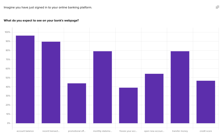
Account balance and recent transactions were the two most expected types of information on the dashboard, followed closely behind by transfer money and monthly statements. This provides direction for the design of Banko’s dashboard, so that the most prominent elements on the page match with what users want to see.
This user-centered approach ensures that your dashboard not only looks good but also functions well, providing users with the information they need in a clear and accessible manner.
Balancing the Number of Pages How-tos
The number of pages in a dashboard refers to the division of information across multiple screens. While more pages can help organize data and reduce clutter, they can also complicate navigation. Finding the right balance is key to creating an effective dashboard that is both comprehensive and user-friendly.
Pros and Cons of Single-Page vs. Multi-Page Dashboards
- Single-Page Dashboards: Provide all information at a glance but can become cluttered if too much data is displayed. They are ideal for users who need to access multiple data points quickly without switching screens. However, the challenge is to maintain clarity and avoid overwhelming users.
- Multi-Page Dashboards: Organize data better by dividing information across multiple screens, which can reduce clutter and enhance focus. However, they require users to navigate between pages, which can complicate the user experience if not designed intuitively. Multi-page dashboards are useful for detailed analysis and in-depth data exploration.
Best Practices for Multi-Page Dashboard Design
- Logical Grouping: Group related data together to help users find information quickly. For example, financial metrics can be on one page, while operational metrics are on another.
- Clear Navigation Paths: Use intuitive navigation elements, such as tabs, menus, and breadcrumbs, to guide users through the dashboard. Ensure that users can easily move between pages without getting lost.
- Consistent Layout: Maintain a consistent design across all pages to create a seamless user experience. Consistent color schemes, fonts, and layout structures help users feel more comfortable and reduce cognitive load.
Testing Multi-Page Designs with Helio
To ensure your multi-page dashboard is effective, it’s crucial to test different designs. Here’s how you can use Helio (helio.app), a user research and testing product, to enhance your balancing of the number of pages:
- First-Click Tests Use first-click tests to assess how easily users can navigate between pages. Helio can track a user’s first click, helping you understand if users can intuitively find the information they need. This is crucial for identifying navigation issues and optimizing the flow between pages.
Implement heatmaps to see which areas of your dashboard users interact with the most. This visual data can highlight which pages and elements are most frequently used and which are ignored. Use this information to optimize the layout and ensure that important information is easily accessible. - Prototype Testing Create prototypes of your multi-page dashboard designs and use Helio to conduct user tests. Collect feedback on the ease of navigation, clarity of information, and overall user experience. Helio’s interactive testing tools can simulate real user interactions and provide valuable insights.
- User Flow Analysis Helio’s user flow analysis can show you how users move through your dashboard. This analysis helps identify any bottlenecks or confusing navigation paths, allowing you to make data-driven decisions to improve the user experience.
Helio Example
Understand whether users can confidently engage with the different elements on your dashboard through interaction testing. With Banko’s dashboard, we needed to understand whether participants could find their way to all of the key areas that were outlined in the earlier expectation testing.
To do so, user flows were analyzed by presenting interaction directives to participants using the dashboard, and measuring the success of participants to click on certain pages.
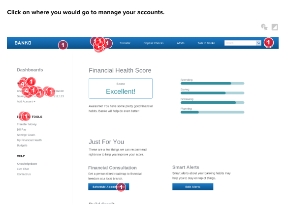
The click data on the page reveals how many users were successful finding that information from their dashboard. Highlighting a specific cluster of clicks shows the percentage of participants who clicked there:
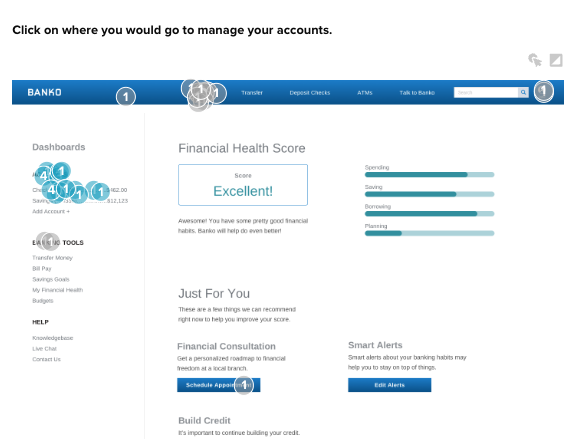
In this case, only 42% of participants clicked on the option to access their accounts from the dashboard, with another 50% instead gravitating towards the separate Accounts page in the top navigation. This shows that the option to jump into account management from the dashboard is prominent enough for the majority of users to engage, indicating that they need to elevate the impact of those pages on the dashboard.
View the Helio Dashboard Test
- A/B Testing Conduct A/B tests with different multi-page designs using Helio. You can determine which layout is more effective by comparing user interactions and preferences between the two designs. A/B testing helps you refine your dashboard based on actual user behavior.
- User Surveys Gather qualitative feedback through user surveys on Helio. Ask users about their experience navigating the multi-page dashboard, what they like, and what improvements they suggest. This direct feedback is invaluable for making user-centric design decisions.
By leveraging Helio for user research and testing, you can comprehensively understand how users interact with your multi-page dashboard.
Resources
Effective Dashboard Resources
Here are some deeper insights on dashboards. We pulled links from authors who shared ideas on effective dashboard design. Check out what growth managers, product marketers, and product managers have to say about getting dashboard design right.
-
How to Use a Feedback Loop to Refine Your Dashboard Design
, by
Rose Curtis
-
From Good To Great In Dashboard Design: Research, Decluttering And Data Viz
, by
Adam Fard
-
Dashboard Design Services: Transforming Data into Insights
, by
Mprakash
-
30+ user research questions for dashboard design
, by
Taylor Nguyen
-
Engaging Your Dashboard Users through User Testing
, by
Silvia Romanelli
-
Dashboard Design: Enhancing Business Through Visualization
, by
Hailey Friedman
Data Abstraction: Simplifying Complexity Howtos
Data abstraction deals with the level of detail presented in a dashboard. Simplifying data through abstraction can make complex information more digestible and highlight key insights. Finding the right balance of detail is crucial for creating a dashboard that is both informative and easy to understand.
Finding the Right Level of Detail
- Highlight Key Insights: Focus on the most important data points. This involves selecting and presenting data that has the most impact on decision-making. Key performance indicators (KPIs) should be displayed to provide immediate insights.
- Avoid Overwhelming Users: Present information in a simplified manner. Too much data can confuse users and make it difficult to find relevant information. Use aggregation and summarization to condense data into more manageable formats.
- Balance Detail and Simplicity: Ensure enough detail to be informative but not overwhelming. It’s essential to strike a balance where the data is detailed enough to be useful but simple enough to be easily understood.
Examples of Effective Data Abstraction
Instead of presenting raw data tables in a sales dashboard, use summary statistics and trend lines to help users quickly grasp performance trends. For instance, a monthly sales trend graph is more digestible and informative than a table listing every sale.
A successful dashboard follows a clear information hierarchy, highlighting critical data prominently while providing supplementary details as needed. This makes it easier for users to absorb key insights and make informed decisions.

Testing Different Levels of Data Abstraction in Helio
To find the optimal level of data abstraction for your dashboard, it’s important to test various designs. Here’s how you can use Helio (helio.app), a user research and testing product, to enhance your data abstraction:
- Prototype Testing Create prototypes with different levels of data abstraction and use Helio to conduct user tests. Collect feedback on which versions users find most informative and comprehensible. Helio’s tools can simulate user interactions with different prototypes, providing insights into user preferences.
- User Feedback and Surveys Use Helio’s survey feature to gather qualitative feedback from users about their experience with different levels of data abstraction. Ask specific questions about which details they find useful and which ones they think are unnecessary. This direct feedback can guide your design decisions.
Helio Example
We used a timed test to understand if the way we’re presenting content on the dashboard allows for the most important content to be quickly grasped by users. We showed the banking dashboard for 15 seconds, and then asked participants to recall what type of information they saw on the page:
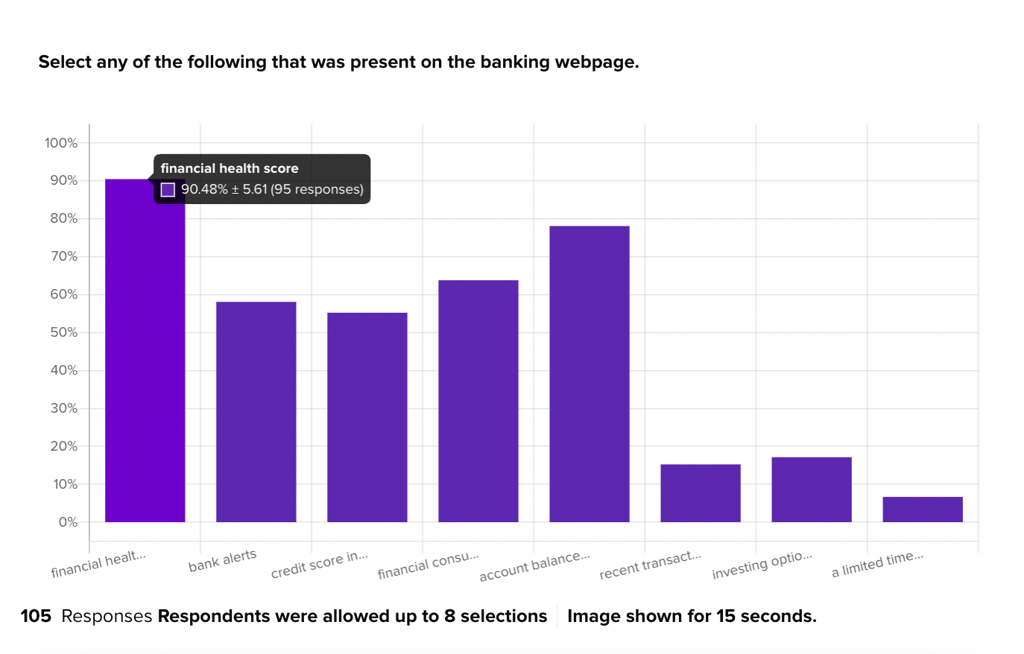
The goal was to understand what elements stand out most to banking consumers as they’re interacting with Banko’s homepage, and gauge if their unique features are making the intended impressions.
This data validated that Banko’s Financial Health Score, one of the primary features they want to emphasize on users’ dashboards, was the most prominent information that participants recognized in the design. This is exciting feedback, because credit score info was expected to be seen on the page by only 40% of participants, so recognition of their financial health score is validation that the feature holds a strong position on the dashboard.
- Usability Testing Conduct usability tests using Helio to observe how users interact with abstracted data presentations. This can help identify any areas where users struggle to understand or find the information they need, allowing you to adjust the level of detail accordingly.
- Click-Tests Use click-tests to see how easily users can find and interact with abstracted data. Helio can track where users click first and how long it takes to locate key information. This data can help you refine the abstraction level to ensure it is accessible and informative.
- A/B Testing Conduct A/B tests with different levels of data abstraction to compare user interactions and preferences. Helio’s A/B testing capabilities allow you to experiment with multiple designs and determine which one provides the best balance of detail and simplicity.
This user-centered approach ensures that your dashboard is both functional and user-friendly, providing valuable insights in an accessible format.
Enhancing Dashboard UI Interactivity Howtos
Interactivity in a dashboard allows users to explore data dynamically, providing deeper insights and a more engaging user experience. However, high interactivity can also increase complexity and the learning curve. To create an interactive dashboard that remains user-friendly, it’s essential to strike the right balance between interactivity and usability.
Types of Interactive Elements
- Filters: Filters allow users to customize the data view based on specific criteria. For instance, in a sales dashboard, users might filter data by date range, region, or product category to see more targeted insights.
- Drill-Downs: Drill-downs enable users to explore data in greater detail. By clicking on a data point, users can access more granular information. For example, clicking on a total sales figure might reveal individual salesperson or product sales.
- Hover-Over Information: Hover-over information provides additional details on demand. When users hover over a data point, a tooltip or popup can display extra context, such as precise values or explanations.
Balancing Interactivity with Usability
- Smooth User Experience: Interactivity should not complicate the user experience. Interactive elements should enhance the dashboard’s functionality without making it confusing or difficult to navigate.
- Minimize Learning Curve: Keep interactive elements intuitive and easy to use. Users should be able to understand how to interact with the dashboard without extensive training. Simple, well-designed interactive features can significantly improve the user experience.
Using Helio to Enhance Interactivity
To optimize the interactivity of your dashboard, it’s important to conduct thorough testing and gather user feedback. Here’s how you can use Helio (helio.app), a user research and testing product, to enhance your dashboard’s interactivity:
- Prototype Testing Create prototypes of your interactive dashboard elements and use Helio to conduct user tests. Collect feedback on the ease of use and effectiveness of interactive features. Helio’s interactive testing tools can simulate user interactions, providing valuable insights into user preferences.
- Click-Tests Implement click-tests to make data-driven decisions and optimize interactivity. Helio can track where users click and how they navigate through the dashboard, helping you understand user behavior and identify areas for improvement.
Usability Testing Conduct usability tests using Helio to observe how users interact with various interactive elements. This can help identify any areas where users struggle to use the interactive features, allowing you to refine and simplify them.
Helio Example
Track interaction success of key actions on your dashboard using the Interaction Matrix framework produced through Helio testing.
The same type of click testing used to analyze user flows earlier can also be used for ensuring interaction success of key actions over time. Participants are asked to interact with the dashboard to achieve several user goals within a single survey, and the overall success of that design iteration is logged in the Interaction Matrix.
Banko’s dashboard was tested in the same way, with the baseline data being logged and then analyzed to determine how they can be improved:
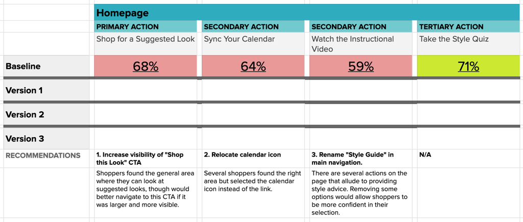
Primary actions such as a viewing account balance or recent transactions are expected to have over 80% success on participants’ first click. Secondary actions, like accessing credit score information, are expected to land above 70%, and all other tertiary actions should show at least 55% successful interactions on first click.
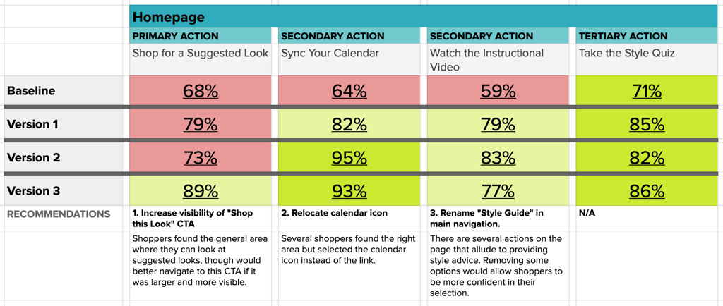
- As the problem actions in each round of testing are revealed, new designs are created to resolve the issue and work towards a row of all green interactions in the matrix.
View the Interaction Matrix Guide - A/B Testing Use A/B testing to compare different interactive designs. Helio’s A/B testing capabilities allow you to test multiple dashboard versions and determine which interactive features provide the best user experience.
- User Surveys Gather qualitative feedback through user surveys on Helio. Ask users about their experience with the interactive elements, what they find useful, and what improvements they suggest. This direct feedback can guide your design decisions and ensure your dashboard meets user needs.
A well-designed interactive dashboard provides users with valuable insights in an accessible and engaging manner, making it a powerful tool for data-driven decision-making. use a variety of survey and testing tactics to gather feedback on your dashboard and how it is received by users, just like we did for Banko.
Dashboard Design Best Practices
Creating an effective dashboard involves more than just displaying data; it requires careful consideration of design principles that enhance usability and user experience. Here are some best practices for dashboard design:
User-Centered Design Approach
Focus on the needs and preferences of your users. Understand who will be using the dashboard and tailor the design to meet their specific needs. This involves conducting user research to gather insights into what users find most useful and how they interact with the dashboard.
Feedback Loops
Continuously gather user feedback to refine the dashboard. Implementing feedback loops allows you to make iterative improvements based on user experiences and suggestions. Use tools like Helio (helio.app) to conduct regular user testing and surveys to keep your dashboard aligned with user needs.
Clear Information Hierarchy
Highlight critical data prominently while providing supplementary details as needed. A clear information hierarchy ensures that users can quickly find and understand the most important information. Use visual cues such as size, color, and placement to differentiate between primary and secondary data.
Responsive Design
Ensure the dashboard is accessible on various devices. Since users access dashboards on desktops, tablets, and smartphones, it’s essential to design a responsive layout that adapts to different screen sizes. This ensures a consistent and user-friendly experience across all devices.
Consistent Color Schemes and Fonts
Maintain a cohesive look and feel using consistent color schemes and fonts. Consistency in design elements helps create a professional appearance and makes it easier for users to understand and navigate the dashboard. Choose colors and fonts that align with your brand and enhance readability.
Advanced Tips for Modern Dashboard Design
To take your dashboard design to the next level, consider incorporating advanced features and techniques that improve functionality and user engagement. Here are some advanced tips for modern dashboard design:
- Incorporating Real-Time Data Display live data for up-to-date insights. Real-time data can provide users with the most current information, allowing for timely decision-making. Use real-time data feeds to keep your dashboard updated without requiring manual refreshes.
- Using Interactive Charts and Graphs Enhance data visualization with interactive elements. Interactive charts and graphs allow users to explore data in more depth. For example, users can click on a graph to see detailed information, filter data points, or adjust time ranges. These features make the dashboard more engaging and informative.
- Designing for Different User Roles Tailor the dashboard to meet the needs of different user roles, such as executives and analysts. Different users have different requirements and preferences. Executives might need high-level summaries and KPIs, while analysts might require detailed data and the ability to drill down into specifics. Designing with user roles in mind ensures that the dashboard serves its intended purpose effectively.
- Integrating Performance Metrics and KPIs Ensure that key performance indicators (KPIs) are easily accessible. KPIs are critical for tracking performance and progress towards goals. Integrate these metrics prominently in your dashboard to give users quick and clear insights into their performance. Use visual elements like gauges, charts, and tables to present KPIs effectively.
Implementing Successful Dashboard Design UX
By following these advanced tips and best practices, you can create a modern, user-friendly dashboard that looks great and delivers powerful insights. Remember, the key to successful dashboard design is continuous improvement through user feedback and testing. Use tools like Helio to gather insights and make data-driven decisions that enhance your dashboard’s effectiveness and user satisfaction.
Balancing the key parameters of screenspace, number of pages, data abstraction, and interactivity is crucial for effective dashboard design. By adhering to the best practices outlined in this post and continuously testing and refining your design, you can develop functional and user-friendly dashboards. This approach ensures that your dashboards meet user needs and provide valuable insights to support informed decision-making.
Dashboard Design FAQ
The key parameters in dashboard design include screenspace, the number of pages, data abstraction, and interactivity. Balancing these parameters ensures that the dashboard is both functional and user-friendly. Proper screenspace management, interactivity, logical data abstraction, and page navigation can help create an effective dashboard.
Effective screenspace management involves prioritizing essential information, avoiding clutter, and using visual hierarchy. Displaying critical data prominently and using whitespace effectively improves readability. Arranging elements to first guide the user’s eye to the most important information helps create a functional and visually appealing dashboard.
Single-page dashboards provide all information at a glance but can become cluttered if too much data is displayed. They are ideal for quick access to multiple data points. On the other hand, multi-page dashboards organize data better by dividing information across multiple screens, which can reduce clutter but may complicate navigation if not designed intuitively.
Data abstraction simplifies complexity by focusing on the most important data points and presenting information in a simplified manner. This involves using aggregation and summarization to condense data into more manageable formats, ensuring enough detail to be informative without overwhelming the user. Effective data abstraction highlights key insights and makes complex information more digestible.
Interactive elements such as filters, drill-downs, and hover-over information enhance a dashboard’s usability. Filters allow users to customize the data view, drill-downs enable detailed data exploration, and hover-over information provides additional context on demand. These elements make the dashboard more engaging and informative while maintaining a smooth user experience.
Helio can gather user feedback and conduct various tests to improve dashboard design. Prototype testing, click-tests, heatmaps, A/B testing, and user surveys on Helio can provide valuable insights into user preferences and behavior. This data helps refine screenspace management, navigation, data abstraction, and interactivity to create a more effective dashboard.
A user-centered design approach ensures that the dashboard meets the needs and preferences of its users. By conducting user research and gathering continuous feedback, designers can make iterative improvements based on actual user experiences. This approach results in a dashboard that is intuitive, functional, and aligned with user requirements.