

Your product is visually unappealing and disjointed. Your customers may not be telling you. They just leave. We’ll build a stunning library of visual style, components, and interactions as code and design tools. to create a cohesive and efficient build process.
Style Guide
We’ll define a set of rules that shapes the visual design basics, which includes brand, colors, typography, iconography, and tone of voice.
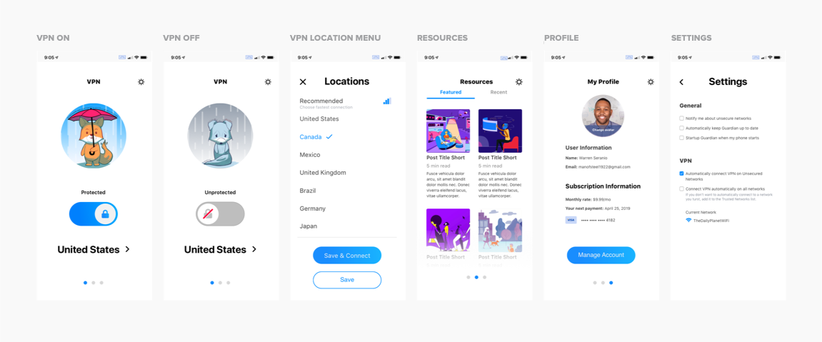
SIGNALS
Tested with Privacy-focused Internet Users, Security Conscious Internet Users, Savvy Media Streamers
98%
Success rate by Security Conscious Internet users turning on their VPN.
93%
Of internet users find themselves confident or very confident in knowing how to turn on and off the VPN.
63%
Of internet users are very likely to subscribe to this VPN experience
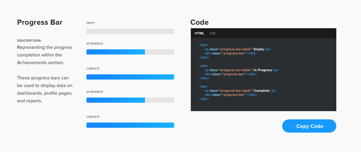
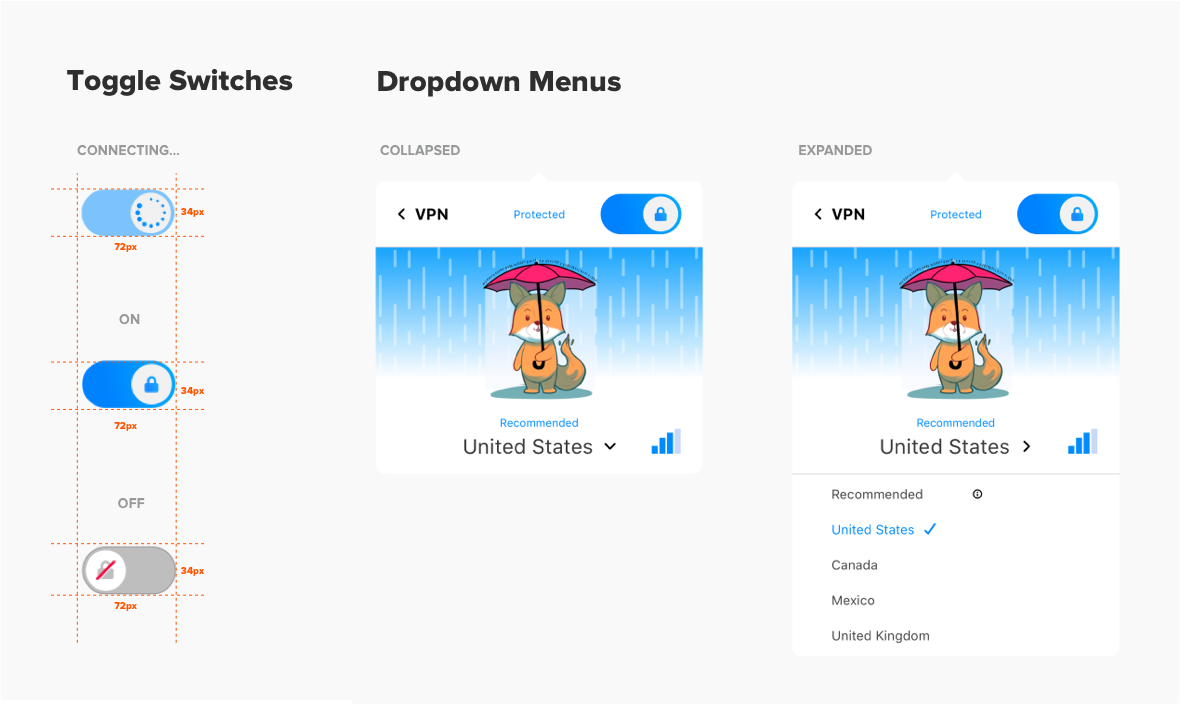
Pattern Library
We’ll design a set of UI elements with purpose and context to make your style guide practical and easy to implement with your team.
Components Library
We’ll build a repository of coded components and interactions. Each designed component is documented with a code snippet so your development team can efficiently create and assemble unique designs.