Research Study
Zoho Landing Page Optimization
Improved User Engagement and Conversion Potential on Zoho’s CRM Landing Page

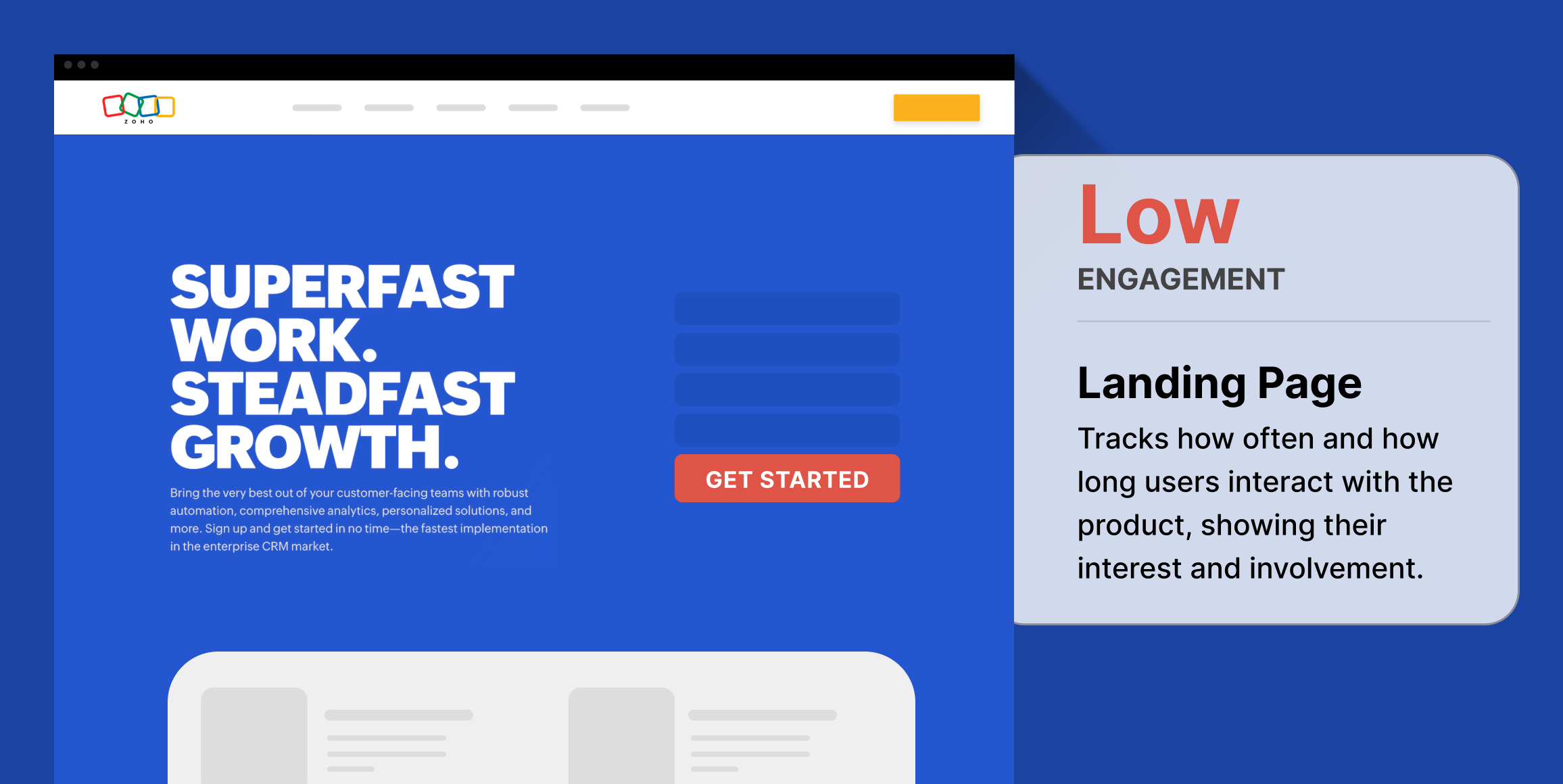
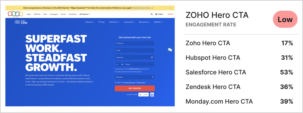
Low Click-Through Rate (CTR) on the Main Action
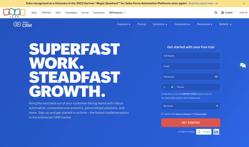
The ‘Get Started’ form had a low initial click-through rate, indicating users’ reluctance to fill it out.
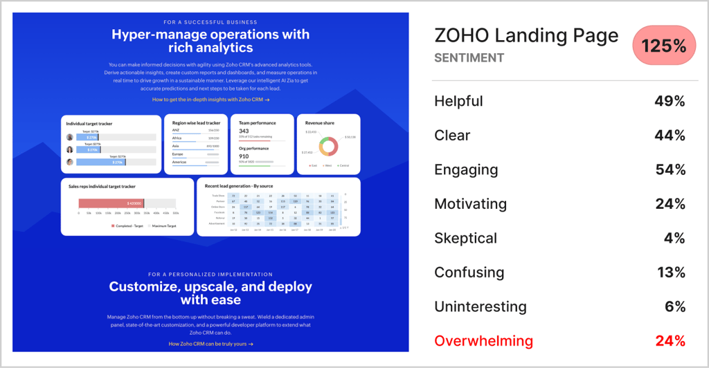
Overwhelming Landing Page
24% of users felt overwhelmed by the content, highlighting the need for a more streamlined design.
Low Net Promoter Score (NPS)
Due to the aversion to the form and overwhelming content, the landing page received a low NPS of -22.6.
Business Challenge
This independent research aimed to evaluate Zoho’s CRM landing page to capture and convert visitors. The findings were compared with competitor landing pages to identify opportunities for optimization.
Timeline
The testing was completed in 24 hours. After running the test overnight, the findings were synthesized the following day
Research Goals
The main goal of the study was to assess the clarity and appeal of the CRM offer presented on the landing page, and compare its performance to that of competitor landing pages.
Methodology
Zoho’s landing page was tested using remote user surveys via Helio, incorporating quantitative and qualitative feedback from consumers. The same survey was applied to four competitor landing pages to benchmark Zoho’s performance against competitors.
Participant Panel
The study gathered feedback from 100 marketing and sales professionals in the United States for each of the five landing pages tested.
Test Setup
The survey combined NPS scoring, satisfaction scales, and open-ended questions to gather quantitative and qualitative feedback on the effectiveness of the landing page.
The setup for the Zoho landing page study included several key areas of focus:
- Comprehension: Participants were asked to explain the purpose of the page. This helped assess whether the page’s messaging and design clearly communicated its purpose. Common keywords like “CRM,” “software,” and “sales” indicated that the page was primarily seen as promoting CRM software for sales teams.
- First Interaction: Participants were instructed to click on the element they would naturally choose first when using online tools. This identified the main areas of interest or initial engagement points on the page. A follow-up question explored their reasons for these choices, with frequent mentions of “software,” “CRM,” and “free.”
- Information Seeking: Participants clicked on the sections they would visit to determine if the tool could be useful for their company. This highlighted which parts of the page were seen as most informative. A follow-up question explored their reasoning, with “product,” “company,” and “software” being common terms.
- Emotional Reaction: Participants were asked to share their overall impression of the page, selecting from multiple options and explaining their choices. This provided insight into how the page’s content and design were perceived.
- Likelihood to Engage: An NPS question measured how likely participants were to use Zoho for their business, on a scale from 0 to 10. The median score was 8, and follow-up questions helped understand the reasoning behind their ratings, with keywords like “software,” “free,” and “business” frequently mentioned.
The overall test was designed to assess how well the page attracted users’ attention, the clarity and usefulness of the information provided, the general impression of the page, and the likelihood of the product being adopted. The use of common keywords and follow-up questions offered deeper insights into user motivations and potential barriers to conversion.
Findings
Low Engagement on Primary Action: Only 17% of users clicked on the ‘Get Started’ form, significantly lower than the 40% average for competitor pages. Users preferred to learn more about the platform without filling out a form.
Overwhelming Content: A substantial 24% of visitors felt overwhelmed, and 13% were confused, leading to a net positive alignment of 124%, the second lowest Sentiment among competitors.
Low Net Promoter Score: The page’s low NPS of -22.6 was the lowest of all CRM competitors, indicating significant room for improvement.

Conclusion:
Zoho’s landing page research study revealed significant improvements they can make to catch up to their competition, specifically in terms of the positive sentiment their site elicits from visitors and engagement on their hero CTA.
Recommendations
- Remove Form Barriers: Provide an alternative path for users to learn about the service without requiring early form submission.
- Simplify Content: Reduce the number of content modules to minimize overwhelming impressions.
Reflections
Given the dense content on Zoho’s landing page, follow-up testing could involve asking users to rank the information presented, helping to prioritize and streamline the content.
