IU Online’s Index Page Engagement
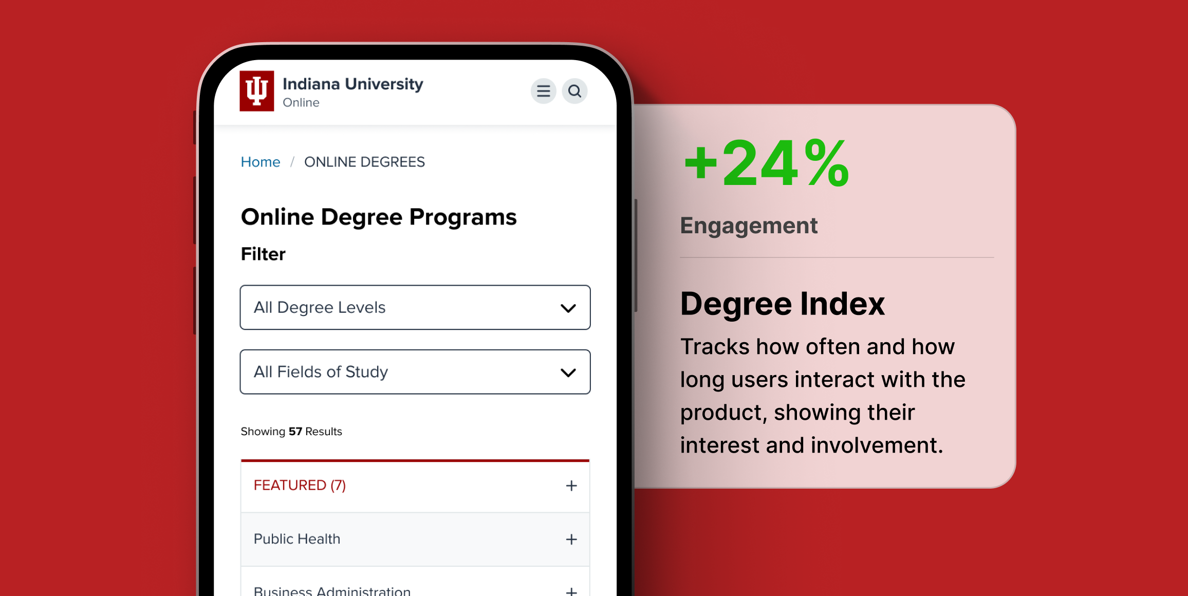
Increased user engagement with IU Online’s degree index page through feature validation.

Low engagement on baseline
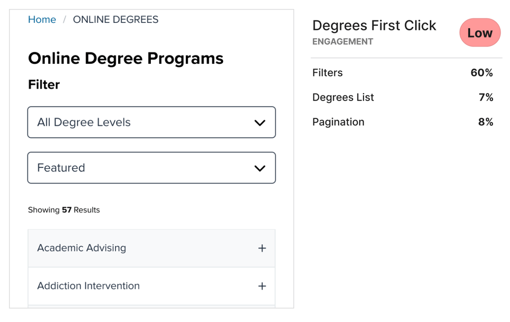
Only 7% of visitors interacted with the list of degrees.
Improvement with new versions
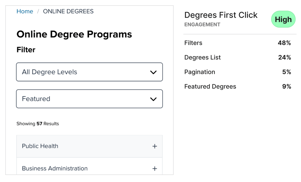
Re-organizing the degree list immediately improved engagement, up to 24%.
Drop in satisfaction with highlight
Visual elements didn’t improve the reaction to the degree list, with an 18% drop in satisfaction.
Business Challenge
Indiana University redesigned their website and one of the key experiences they wanted to improve was searching for and finding relevant degrees. IU’s current degree index page needed an update badly, and one of the team’s ideas was to prioritize how features are displayed on the degree listing page rather than maintaining the current alphabetical order.
Research Goals
The Indiana University team’s goal was to encourage exploration of different degrees on the index page and increase engagement with 10 of their key school programs.
Timeline
Over the course of a week-long Test & Learn cycle, the Helio team designed 3 variations of the degrees list on the index page, experimenting with different methods of emphasizing IU’s top 10 programs.
Each of those variations were put to the test using Helio surveys, and the data was compared to determine the validity of the feature and the most effective approach.
Methodology
Helio’s unmoderated online surveys were used to present the experience to participants and gather their feedback. 100 participants interacted with each version of the page, answering the same questions so that their responses could be compared across variations. Once the data had been collected, the responses were copied into a data comparison framework for quick evaluation across designs.
Participant Panel
Indiana University tapped into Helio’s ready-made audience of Undergraduate and Graduate College Students in the United States. From there, the IU team worked closely with Helio’s advocates to determine a 3rd key demographic referred to as Stopouts: students who have completed some higher education classes in the past but did not finish.
Test Setup
To start, participants were asked to interact as they naturally would with the page on first click:
Then, a Likert scale gauging satisfaction was used to measure first impressions of the degrees list, specifically with those degrees that they see offered on the first page:
Findings
Low engagement on baseline
- In the current version of the page, with the degrees in alphabetical order, only 7% of participants engaged with the list, instead opting to go directly to the filters and search bar.
Engagement spike with new variations
- With the degrees list being re-organized to show featured degrees up top, those numbers jumped to 19-24% engagement with the list, showing a desire to interact with the page rather than resorting to the search features.
Impact on satisfaction
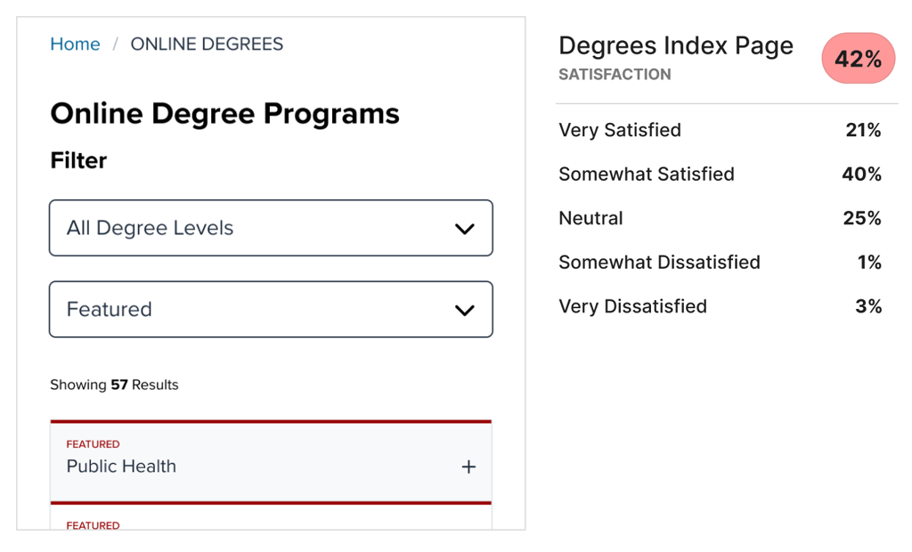
- The versions where we tried out highlights in the degrees list both reduced satisfaction with the look of the page (V2), and reduced engagement on the list when hidden under a dropdown (V3). The team decided to move forward simply with the idea of re-ordering the degree list without trying to introduce visual highlights.
Conclusion
Along with the design variations, testing results, and data comparison framework, the Helio team delivered a high-level deck summarizing the findings from the week of work.
Impact
Through the work done on Indiana University’s website redesign, and the testing employed to inform the design changes along the way, we validated our updates through analytical data within one month of launching the new site.
Indiana University’s online team confirmed that they had seen:
- Applications for the past 4 weeks up over 30% compared to last year
- Apply page views increased by 38.9%
- Site engagement increased by 80.1%
Recommendations
Suggestions for how the Indiana University team can build on this success moving forward:
- Continue to monitor engagement on key pages, ensuring that the design updates maintain relevance and positive performance.
- Track KPIs for page views on key programs that are now prioritized on the degree index page to validate the increased engagement across the site.
Reflections
The IU team really appreciated this feedback and the data and insights regarding engagement on the index page. We’re confident with the version that we decided to move forward with based on the data. In future testing, it would be great to segment participants by their actual desired major to see if that has an impact on how they engage with the page.
Low engagement on baseline
- In the current version of the page, with the degrees in alphabetical order, only 7% of participants engaged with the list, instead opting to go directly to the filters and search bar.

Engagement spike with new variations
- With the degrees list being re-organized to show featured degrees up top, those numbers jumped to 19-24% engagement with the list, showing a desire to interact with the page rather than resorting to the search features.

Impact on satisfaction

- The versions where we tried out highlights in the degrees list both reduced satisfaction with the look of the page (V2), and reduced engagement on the list when hidden under a dropdown (V3). The team decided to move forward simply with the idea of re-ordering the degree list without trying to introduce visual highlights.
Conclusion
Along with the design variations, testing results, and data comparison framework, the Helio team delivered a high-level deck summarizing the findings from the week of work.
Impact
Through the work done on Indiana University’s website redesign, and the testing employed to inform the design changes along the way, we validated our updates through analytical data within one month of launching the new site.
Indiana University’s online team confirmed that they had seen:
- Applications for the past 4 weeks up over 30% compared to last year
- Apply page views increased by 38.9%
- Site engagement increased by 80.1%
Recommendations
Suggestions for how the Indiana University team can build on this success moving forward:
- Continue to monitor engagement on key pages, ensuring that the design updates maintain relevance and positive performance.
- Track KPIs for page views on key programs that are now prioritized on the degree index page to validate the increased engagement across the site.
Reflections
The IU team really appreciated this feedback and the data and insights regarding engagement on the index page. We’re confident with the version that we decided to move forward with based on the data. In future testing, it would be great to segment participants by their actual desired major to see if that has an impact on how they engage with the page.