Are you watching potential users slip through the cracks? It’s a common tale: a visitor lands on your page, browses around, but leaves without a trace—not a sign-up in sight. What if you could decode the mystery behind the hesitation? What if you could improve your signup conversion rate? Well, the secret isn’t just in the allure of your offer but in a clever, three-pronged hack that we’ve distilled into a deceptively simple game plan.
In the digital realm, a robust sign-up rate is the holy grail of user engagement, and it’s about to get much easier to achieve. Forget the generic advice you’ve heard a million times. Instead, let’s embark on a tactical deep dive that reveals the why and the how behind transforming casual browsers into committed users.
This isn’t just about sprucing up your interface or crafting the perfect sales pitch. It’s about the psychological art of conversion—understanding the subtle nuances that encourage a user to take action. Ready to unlock the full potential of your sign-up rate?
Let’s peel back the curtain and show you how to master the conversion game.
But first, let’s discuss general signup tactics
It’s all about the carrot and the stick. Present a tantalizing offer that’s too good to pass up—clear value, an answer to their needs, all wrapped up in a neat package. Then, make the path to grabbing that carrot as smooth as possible. A sign-up form should be a quick pitstop, not a roadblock.
Ask for just the essentials and nothing more. And while you’re at it, why not flaunt a bit? Show off those glowing testimonials and five-star reviews right where the action is. It’s like having your best customers cheering from the sidelines.
If you can understand what users are hoping to achieve in your product, and then go ahead and build the path(s) that will deliver that experience, then you’re already 99% of the way there.

— Yaakov Carno, Founder, Valubyl

Now, the magic words—your Call to Action. Think of it as the coach’s halftime pep talk; it’s got to be punchy and direct. “Join now,” “Get started,” “Claim your spot”—make it irresistible. But don’t just set it and forget it. Consider sweetening the deal with something extra if you’re a consumer-driven site. A discount, a trial period, or an exclusive download can turn a maybe into a yes.
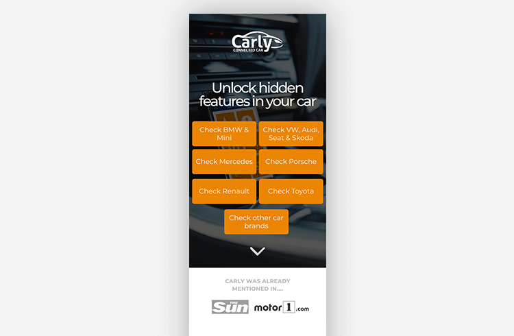
Lastly, in this mobile-first world, your sign-up sheet has to look just as snazzy on a phone as on a desktop. For example, Carly sells a sophisticated tool that enables car drivers to diagnose and code their cars. This landing page is designed to funnel potential customers into the right checkout flow for their needs.
Quick tip: Are those folks trying to exit your site? A well-timed exit-intent popup makes them stick around. And if they do slip away, chase them down with a friendly email reminder. Keep it light, breezy, and above all, ensure they know their info is safer with you than their secrets are with their best friend. Play your cards right, and those sign-up numbers will be climbing quickly.
Understanding the Sign-Up Conundrum
First, let’s be clear: improving sign-up rates isn’t solely about beautifying your landing page. It’s deeper than design—it’s about understanding the ‘why’ behind a user’s decision to engage with your service.
Sign-ups are not just about tweaking your homepage; there’s more to it. Yaakov Carno cleverly illustrates the challenge. He has a great post on it.
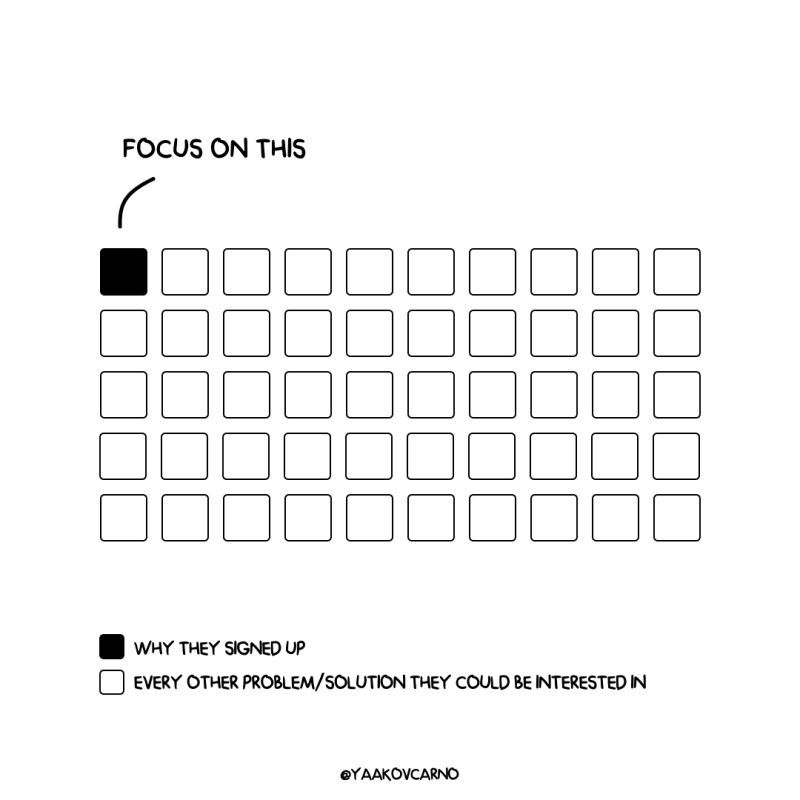
Capturing signups is like playing a game of whack-a-mole. Why do people leave your page? Why does a prospect signup but never come back? Directly asking users why they signed up won’t give you clear answers either.
So…how do you figure out what drives a signup? The easiest place to start is knowing why people potentially DON’T want to use your service. Here’s a three-step hack to figure out your white boxes.
Here’s a three-step hack to improve your signup conversion rate
The hack method helps you enhance your service’s sign-up rate through informed analysis and targeted user feedback. It begins with a competitive analysis using an AI service to understand the common features and benefits that draw users to your competitors’ services.
1. Evaluate competitors with AI
Use an AI service with the prompt:
“Visit these competitive sites:
• Competitor1 dot com
• Competitor2 dot com
….
Based on the commonalities of features and benefits, rank the top ten reasons in an ordered list of why people would use these services.”
→ You’ll immediately have a structured list of features and benefits to consider.
This knowledge forms a foundation for the next step, where you use Helio, a user testing platform, to gather direct feedback from users interacting with your homepage. You pinpoint your site’s most engaging aspects by asking pointed questions and observing user behavior.
To put this method to the test, we asked Google’s Bard AI platform to run this command for competitors in the money management market: Rocket Money and PocketGuard. We then used the information provided about these competitors to develop signals and conversion solutions for a third competitor, Goodbudget.
Here’s what Bard AI produced when we ran the above command:
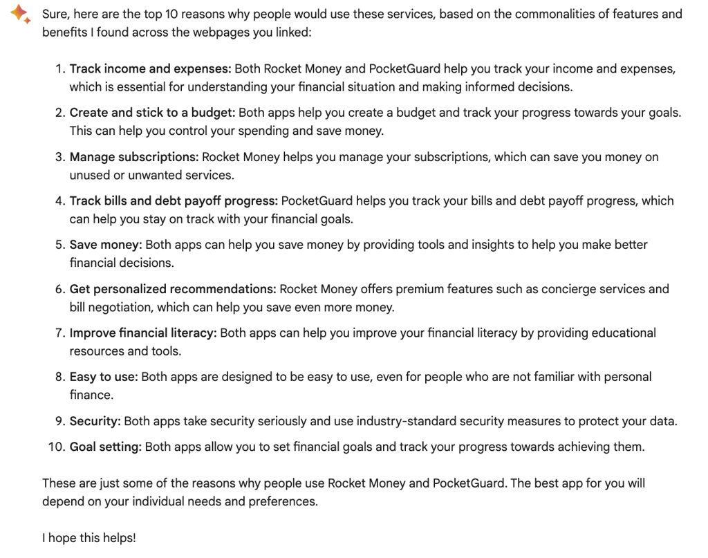
Now we have a list that defines “what is” in the market, and we can use this to influence what can be for Goodbudget’s homepage.
2️. Test your homepage in Helio with a screenshot
Using a targeted audience of 100 participants that fit your ideal customers, ask these three questions:
• What does this service do?
• Click where you would go first.
• What was most compelling?
→ Assemble an ordered list of repeated answers and click actions. You should find five.
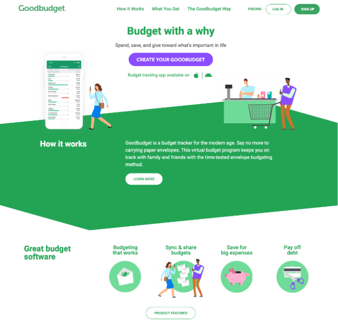
We tested Goodbudget’s homepage using the 3 questions above and gathering feedback from an audience of Mobile Banking Consumers in the US.
Starting with a comprehension question, we’re able to gauge these participants’ understanding of the solution using their own words.
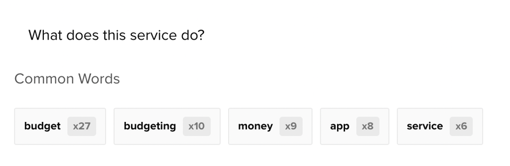
Common word filters can be used to start sifting through the qualitative data. Obviously, the ‘budget’ aspect should be clear on Goodbudget’s homepage, though financial connection and recognition of services provided could be stronger.
Upon further review of the open-ended responses, we found that a key element of Goodbudget’s market positioning is missing: recognition of the envelope budgeting method.
The ‘envelope budgeting method’ is a key financial practice that Goodbudget mentions on their homepage, however only a single participant noticed the idea:
I don’t know anything about the envelope budgeting method, so I would be curious to check that out.
– Mobile Banking Consumer (US), Helio Participant
The confusion is clear, however the interest to learn more about the subject proves that Goodbudget has an interesting concept to expand upon, they just need to market it better.
When examining the click test data, we found some deficiencies in user engagement with the homepage’s primary CTA. The team has clearly emphasized the purple ‘Create Your Goodbudget’ button in the middle of the page (20% of first clicks), however the ‘How It Works’ (22%) and ‘Learn More’ (28%) CTAs actually receive more attention on first click.
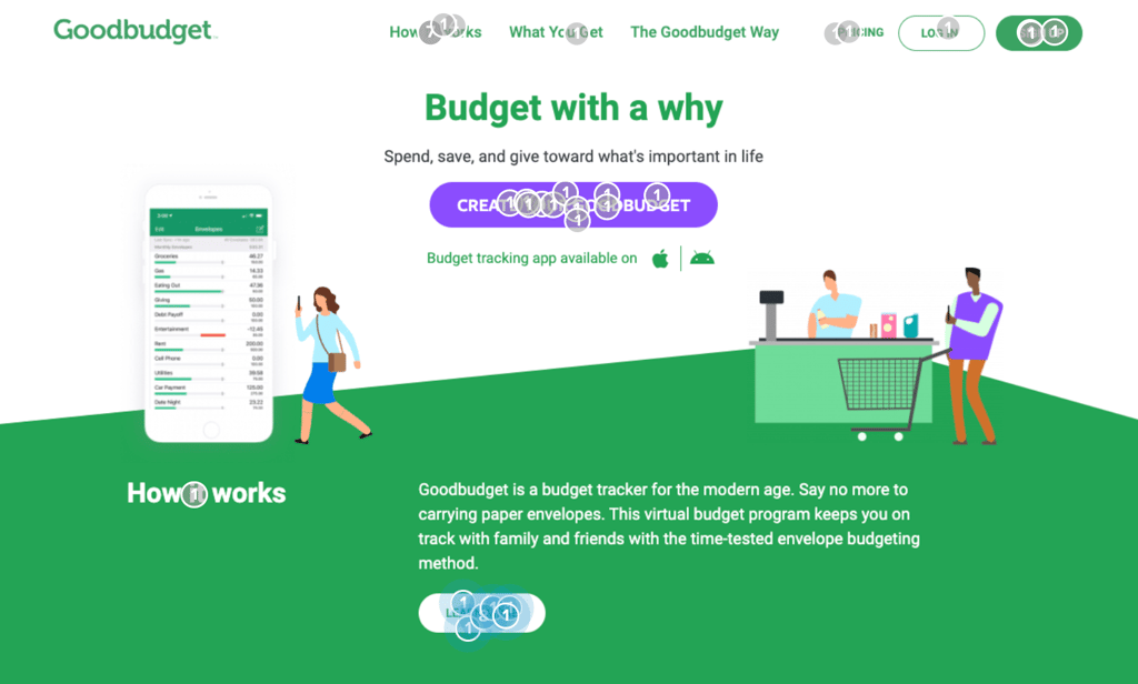
Improving the clarity of the purple Goodbudget CTA, and selling visitors on why jumping into budget creation can be easy and informative, will go a long way towards increasing engagement with this action.
From our final question, we learned what content on Goodbudget’s current homepage mobile banking consumers find most compelling. Based on participants’ qualitative feedback the list we developed was:
- ability to share budgets with others
- novel envelope budgeting method
- ability to help people pay off debt
- Real product images
- budget tracking on a daily basis
3. Prioritize features and benefits
Using a bit of your intuition, combine the lists from steps 1 and 2, introducing features that you feel are your service differentiators. Create another Helio test with this same audience type.
Present the list. Ask participants these three questions:
• Which feature is a must-have?
• Can you rank the list by importance?
• Can you bucket these into must-haves and nice-to-haves?
→ This exercise will help you identify which features and benefits are not worth focusing on (…and potentially highlight strong validation of your service!).
Based on the competitor review and the testing of Goodbudget’s homepage, we determined that these 8 elements are key to show on the homepage of a money management app:
- Support bills & debt payoff
- Daily budget tracking and analysis
- Financial goal setting
- Envelope budgeting method
- Share & sync budgets with others
- Personalized financial recommendations
- Manage subscriptions
- Saving for big purchases
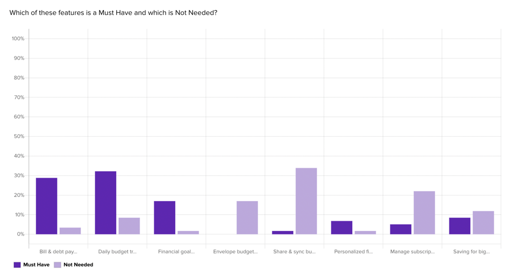
The 3 questions above were used to put these 8 concepts to the test with our audience of mobile banking consumers in a feedback survey. First, a maxdiff question was used to find the features on the ends of the spectrums, those that are ‘must-haves’ or not needed at all:
The same list was put to the test with a ranking question, so that we not only see the ends of the spectrum, but where features fall along the spectrum in terms of importance:
Finally, a card sort feature allowed us to group the features so that we understand definitely which are necessary and which are just nice to have:
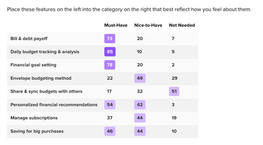
Despite significant interest in the innovative budget sharing feature that Goodbudget brings to the table, it was repeatedly listed as an unnecessary feature with low importance. Goodbudget’s novel digital approach to the envelope budgeting message also clearly needs some explanation, as it fell to the bottom of the importance rankings. However, it’s clear placement in the nice-to-have bucket indicates that there is some user interest in that feature.
Some of the features that rose to the top, which Goodbudget can start to implement on their own homepage, include personalized financial recommendations and managing user subscriptions.
This final step involves blending these insights with your unique service differentiators in a subsequent Helio test. This allows users to help you identify which features are must-haves and which are just nice-to-haves.
This hack’s effectiveness lies in using competitor benchmarks and real user preferences to guide your focus on the features that will improve sign-up rates.
Refining the Signup Conversion Rate Strategy
With each iteration of this process, you’ll sharpen your understanding of what drives sign-ups. You’re not just filling out the ‘white boxes’ of potential user desires; you’re pinpointing your ‘black box’—the core reason users choose your service.
Improving your sign-up rate is about much more than just tweaking visual elements. It requires a deep dive into your users’ psyche, a strategic look at the competition, and a bit of intuition. By systematically analyzing and testing your hypotheses about user behavior, you can transform the complex game of user acquisition into a science.
Remember, the key to improving sign-up rates is understanding your service’s unique value and how it resonates with potential users. With the right approach, you can turn those elusive white boxes into a clear, compelling black box that draws users in. Ready to boost your sign-up rates? Talk to a Helio expert to learn more.
Signup Conversion Rate FAQ
Focus on presenting a clear, irresistible offer, simplifying the sign-up process, showcasing social proof, and having a strong, direct call to action.
Only ask for essential information to reduce friction and use a friendly, conversational tone to guide users through the sign-up process.
Competitor analysis helps you understand the appealing features and benefits already working in the market, which you can adapt and improve upon for your service.
Use Helio to conduct user tests by asking targeted questions and analyzing click behavior to determine what users find most compelling about your service.
Users may not provide clear or introspective answers, so it’s better to indirectly observe their behavior and preferences through structured tests and feedback.
With increasing mobile usage, ensuring a seamless sign-up experience on mobile devices is crucial to prevent losing potential sign-ups due to poor user experience.
Regularly reassess and refine your funnel, incorporating user feedback and market trends to align your sign-up process with user needs and preferences.