“B2B customers expect the same experience that B2C customers have.” This is commonly said and understood, but the reality is that designing for enterprise customers involves more complexity. While end users desire an intuitive user interface (UI), their purchasing process reveals additional aspects to consider in the overall B2B product design and user experience.
In this article, we’ll explore why B2B purchase decisions weigh heavily on product design, how you can break the design cycle of doom, and walk through an example of how to use audience testing as a way to show the value of Design. If you want to meet with me, I am happy to share what we’ve learned after 25 years of building brands and products. Simply reach out.
Purchasing Decisions Weigh Heavily on B2B Product Design.
During product discovery, attention is often centered on the system’s key advocates and most frequent users. This focus is a solid starting point for developing a strategic approach. Yet, as Maja Voje highlights, the enterprise sales process encompasses a broader range of individuals. She explains that you are most likely selling to DMU, which consists of:
- Initiator: first thinks of a purchase
- Influencer: influences decision
- Gatekeeper: can say no to the decision
- Decider: decides what to buy
- Buyer: makes the purchase
- User: uses or consumes the purchase
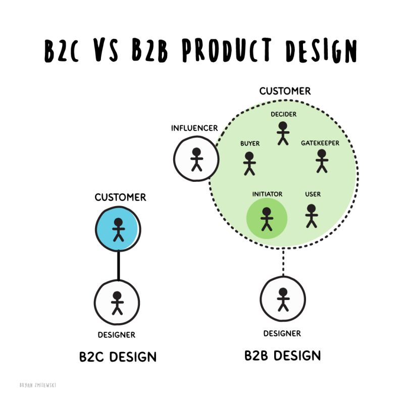
B2B selling is challenging because your go-to-market (GTM) strategies must address the entire Decision Making Unit (DMU). However, the end user plays a critical role as they can reveal additional, perhaps unexpressed, features and experiences within your app.
The champion (or initiator) and the user must be equipped to communicate the product’s value directly to the DMU through its features and functionality.
This implies that for successful product adoption, it’s crucial to integrate certain aspects into the user experience. These include features that demonstrate the product’s value, onboarding users, encouraging ongoing usage, and providing ways for users to manage product usage.
The changing dynamics within an organization can make understanding the priorities and needs of different buying group members challenging. This variability complicates determining which features to prioritize in the product.
Challenges of B2B Product Design: The Design Cycle of Doom
Ryan Scott recently pointed out a common misunderstanding that limits the full use of Design. He notes that many teams still mistakenly believe Design is about how things look, but its true value goes much deeper.
Design is fundamentally about understanding what users struggle with and determining the importance of different features. These skills are crucial for navigating the complexity of product management.
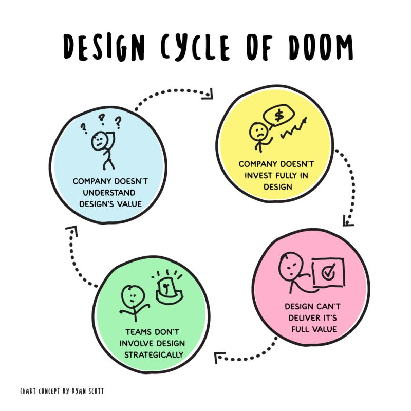
Ryan suggests the cycle of undervaluing Design is self-perpetuating: companies that fail to grasp its significance inevitably invest less, relegating Design to a subsidiary role under product management, not engaging with Design strategically, favoring the employment of junior designers, and skimping on necessary training.
Companies that don’t understand Design don’t invest enough in it. This cripples Design, furthering the bias that designers are less capable than other functions. This fuels further lack of investment. The cycle repeats from there.

—Ryan Scott, Founder, Leading Design Co.
Break the Cycle with Audience Feedback
Including more customer feedback and data into processes and workflows can help create more awareness of the value of Design. It’s why we created Helio. Here’s how adopting continuous discovery can disrupt these struggles:
- Keep learning from users: Use continuous discovery to constantly learn from users, proving design’s worth and improving products.
- Show ongoing evidence: Continually gather data to convince leaders that investing in design leads to real benefits.
- Design at the start: Include design through continuous discovery, shaping the product’s direction.
- Refine with feedback: Regular user input through continuous discovery helps refine designs to meet user needs and business goals.
- Share continuous wins: Use stories of ongoing successes from continuous discovery to highlight the value of design and encourage a culture that values it.
- Collaborate with teams: Maintain a culture where everyone—designers, developers, managers—collaborates from start to finish, using continuous discovery as a guide.
- Align goals continuously: Make sure design aims are refined through continuous discovery and align with driving business growth and innovation.
It’s not easy to bring a user-centric approach into broken organizational cycles, but preventing product management feature factories is necessary!
Case Example: Using Audience Feedback in the Design Process
Teams should be enabled to test their designs with an audience. To illustrate this through the lens of conversational UI design, we asked an audience of 100 home cooks in the United States to evaluate Google’s Bard—a conversational AI tool—against ChatGPT using the same prompts as a control:
Imagine you need to find a recipe for a fun Halloween themed snack.
Click where you would go first on this AI tool.
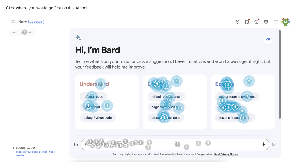
We found that 39% of users start on Bard’s platform by interacting with a command suggestion, compared to only 12% on ChatGPT. Bard AI’s more expansive list of category suggestions provides an engaging feature for more users to interact with. This acts as a guide for users, supporting this core principle of conversational user interfaces.
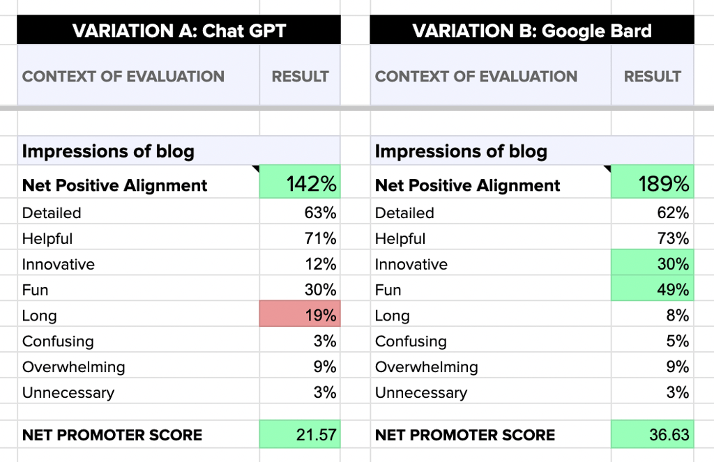
Using Net Positive Alignment (NPA), you can quantify the personality and tone that you’ve imbued in your platform. NPS is the sum of positive impressions produced by an experience minus the sum of negative impressions, much like a Net Promoter Score. It gives a clean and singular data point to compare emotional reactions across test variations.
In our Halloween snack example, we found that Google Bard has a higher Net Promoter Score (36.63) than Chat GPT (21.57), and its Net Positive Alignment is 189% versus Chat GPT’s 142%. These figures indicate that users are generally happier with Google Bard.
Test Your Designs With Helio
Test brand ideas, campaign variations, screens, Figma prototypes, imagery, content, and more with targeted audience panels. With results filling in minutes, you can get data signals in the same day to move your designs forward. Simply reach out to start a conversation with an expert today.
