Conversational user interfaces (UI) are revolutionizing how humans interact with technology. A conversational UI uses natural language processing to enable written or voice conversations between users and computer systems. Unlike traditional graphical user interfaces relying on menus, forms, and buttons, conversational UIs process plain language input to determine user intent and respond conversationally.
Introduction to Conversational User Interfaces
The evolution of conversational UI stems from advancements in artificial intelligence and natural language processing. With sophisticated algorithms capable of analyzing linguistic nuances, machines can now understand natural speech patterns and respond intelligently. Leading tech companies leverage these innovations to develop conversational voice assistants like Alexa, Siri and Google Assistant.
Chatbots are another common manifestation of conversational UI. From customer service bots to personal assistants, chatbots allow users to interact conversationally with computer programs for a streamlined experience. With intelligent natural language capabilities, chatbots transform industries from banking to healthcare by simplifying complex transactions.
The importance of conversational UI continues to grow as technology becomes more integrated into daily life. Conversational interfaces facilitate intuitive interactions that need minimal learning curves by mirroring human-to-human conversations. Conversational UI also allows hands-free control through voice, offering convenience and accessibility. As AI advances, the potential continues expanding.
🔩 The Nuts and Bolts:
- Conversational UI represents a shift from traditional graphical interfaces by enabling natural dialogues between users and technology. Leverages AI advancements like natural language processing to interpret user intent and respond conversationally
- Understanding user goals and contexts is fundamental to designing seamless conversational flows. Prioritizes user-centric principles aligned with brand identity and interaction purpose
- Optimizing for simplicity and efficiency enhances user experience for complex tasks Natural language interactions reduce friction versus navigating complex menus.
- Testing with real users and iterating based on feedback is crucial. Identifies areas for improvement across technical performance and conversational engagement
- Supporting diverse platforms through flexible design expands reach. Responsive web and voice interface principles adapt interfaces across devices and environments
- Building user trust equally important as usability for financial applications. Reliability assurances via brand reputation, visual cues, conversation tone cultivate confidence
- Emerging innovations to enable more predictive, personalized and multimodal systems. Expanded datasets training future algorithms to handle elaborate linguistic nuances
Core Principles of Conversational UI Design
Designing conversational interfaces requires core principles to guide development for optimal user experience. Unlike traditional graphical apps and websites, conversational UIs involve dynamic, free-flowing dialogues without rigid templates. Conversational UI designers must consider key priorities around personalization, simplification, and user-centricity.
Adopting a user-centric approach is fundamental to conversational UI design. Unlike rigid menus and forms, conversational interfaces allow free and natural interactions. Designing for conversational flow puts user needs and expectations first, enabling more human-like exchanges. Prioritizing user goals and contexts guides design decisions around vocabulary, interaction patterns, and dialog flows.
Conversational interfaces also simplify complex tasks using natural language to intuitive interactions. Rather than navigating multiple complex menus, users can initiate requests conversationally to complete actions. Designing for simplicity and efficiency enhances user experience while solving complex use cases.
Centering design around user conversations facilitates more meaningful engagement between humans and technology. Applying core UX principles to natural dialogues creates seamless flows that meet user expectations. Thoughtful design choices also build user trust in the technology behind conversational systems.
Let’s dive into some design principles and examples that shape great conversational UI. Here are ten principles:
- User Understanding
- Clear Communication
- User Guidance
- Personality and Tone
- User Control
- Accessibility
- Performance and Scalability
- Privacy and Security
- Testing and Iteration
- Integration and Contextual Relevance
Conversational User Interface Principles & Examples
Let’s break down each principle with examples. Recently, we created a Helio test to explore how a particular segment might interact differently between ChatGPT and Google Bard—two conversational AI tools. We asked an audience of 100 primary house cooks, home-cooking parents, and home-cooking millennials in the United States to evaluate the user interface of each tool, giving them a scenario of finding a recipe for a fun Halloween themed snack.
Here are the 10 principles identified above, with an example to help illustrate how you can test each with an audience.
1. User Understanding
This principle emphasizes the importance of understanding the user’s needs and behaviors. It involves designing a conversational UI that accurately interprets and responds to user inputs. This requires a deep understanding of the target audience, their language, preferences, and the context in which they will interact with the UI.
Here’s the two most important concepts:
- Natural Language Processing (NLP): Ensure your system accurately understands and processes user input, regardless of slang, typos, or colloquialisms.
- Context Awareness: Maintain context from previous interactions to provide coherent and relevant responses.
The Google Heart framework, developed by the user experience team at Google, was used to evaluate the quality of a product’s user experience. It stands for Happiness, Engagement, Adoption, Retention, and Task Success—each representing a different facet of user interaction and satisfaction. This framework helps translate subjective user experiences into quantifiable data, enabling teams to make informed decisions and drive product improvements.
In our example, we asked an audience of 100 home cooks in the United States how they would interact with ChatGPT to find a Halloween snack recipe:
What would you type into this AI tool to find a Halloween snack recipe?
HI! Looking for a fun Halloween snack recipe! Please share and thank you in advance!

—Home Cooker (U.S.), Helio Participant
Participant’s open-ended feedback showed us that most participants provide their command as a directive rather than a question. It also revealed that many users use pleasantries such as “please” and “thank you” in their conversational UI messages, indicating a desire for a human-like interaction. This is important to understand, and can be used as a lens from which to interpret test results. This understanding can lead to new concepts and ideas to test and validate along the way. View the Helio Example
2. Clear Communication
Clear communication is key in conversational UI. It involves using simple, concise language and providing clear, understandable responses. The goal is to facilitate smooth and efficient interactions without causing confusion or misunderstanding. This principle often involves natural language processing to ensure the UI understands and mimics human-like conversation.
Key ideas:
- Conciseness: Keep responses short and to the point to avoid overwhelming the user.
- Clarity: Use simple, straightforward language to ensure users understand your messages
In our example, we showed participants a screenshot of the AI-generated output from the prompt, “Can you give me a Halloween snack recipe?”
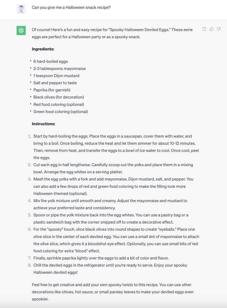
Then, we asked our audience of 100 home cooks in the United States a closed-ended, ‘select all that apply’ question, “How do you feel about this response?” with eight response categories: four positive sentients, and four negative ones:
- Detailed
- Helpful
- Innovative
- Fun
- Long
- Confusing
- Overwhelming
- Unnecessary
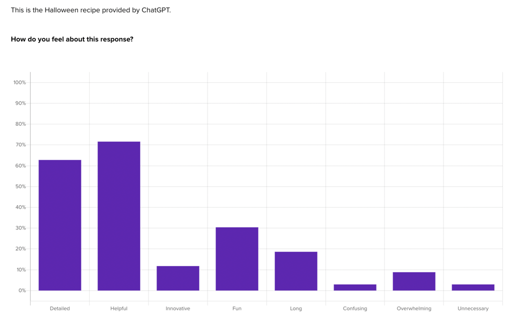
More than 70% of participants selected “helpful” as how they felt about the AI-generated output. However, nearly 20% identified that it was long, and just under 10% said the output was overwhelming. This supports the principle that clarity in communication should be a top priority in a conversational user interface.
3. User Guidance
This principle is about guiding users through the conversation flow. It involves designing a conversational UI that can easily lead users to their desired outcome, providing help and suggestions as needed. This might include offering prompts, clarifying questions, or examples to help users understand the expected input type.
Key ideas:
- Error Handling: Design responses that gracefully handle misunderstandings or mistakes, guiding users back on track.
- Help and Support: Provide clear options or instructions for users who need assistance.
In another test in our example, we asked an audience of 100 home cooks in the United States to evaluate Google’s Bard—a conversational AI tool—using the same prompts as a control:
Imagine you need to find a recipe for a fun Halloween themed snack.
Click where you would go first on this AI tool.
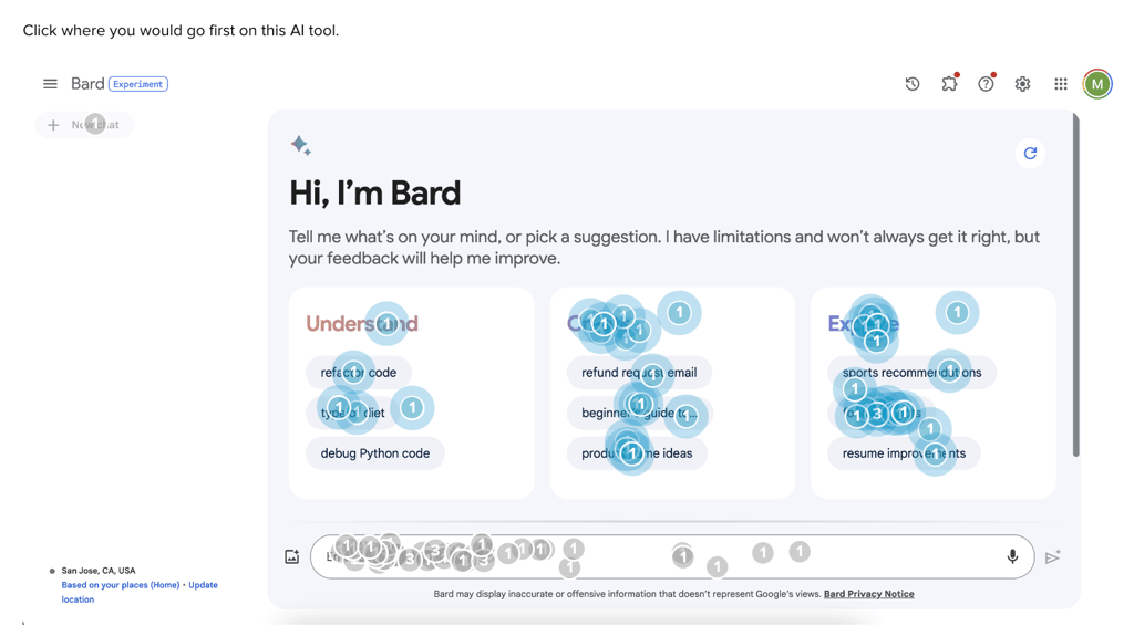
We found that 39% of users start on Bard’s platform by interacting with a command suggestion, compared to only 12% on ChatGPT. Bard AI’s more expansive list of category suggestions provides an engaging feature for more users to interact with. This acts as a guide for users, supporting this core principle of conversational user interfaces. View the Helio Example
4. Personality and Tone
Personality and tone give the conversational UI a distinct character and voice that aligns with the brand’s identity. It’s about making interactions more engaging and relatable. The choice of words, language style, and level of formality all contribute to the personality and tone of the conversational UI.
Key ideas:
- Consistent Voice: Maintain a consistent personality and tone that aligns with your brand and suits the context.
- Appropriate Emotion: Use the right enthusiasm or empathy, depending on the user’s situation.
Helio provides a quantitative way to measure the qualitative effect of the personality and tone that you’ve imbued in your platform. Net Positive Alignment, or the sum of positive impressions produced by an experience minus the sum of negative impressions, gives a clean and singular data point to compare emotional reactions across test variations.
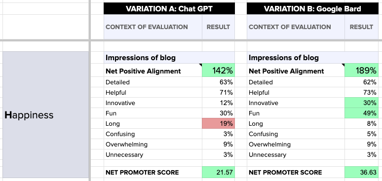
In our Halloween snack example, we found that Google Bard has a higher Net Promoter Score (36.63) than Chat GPT (21.57), and its Net Positive Alignment is 189% versus Chat GPT’s 142%. These figures indicate that users are generally happier with Google Bard.
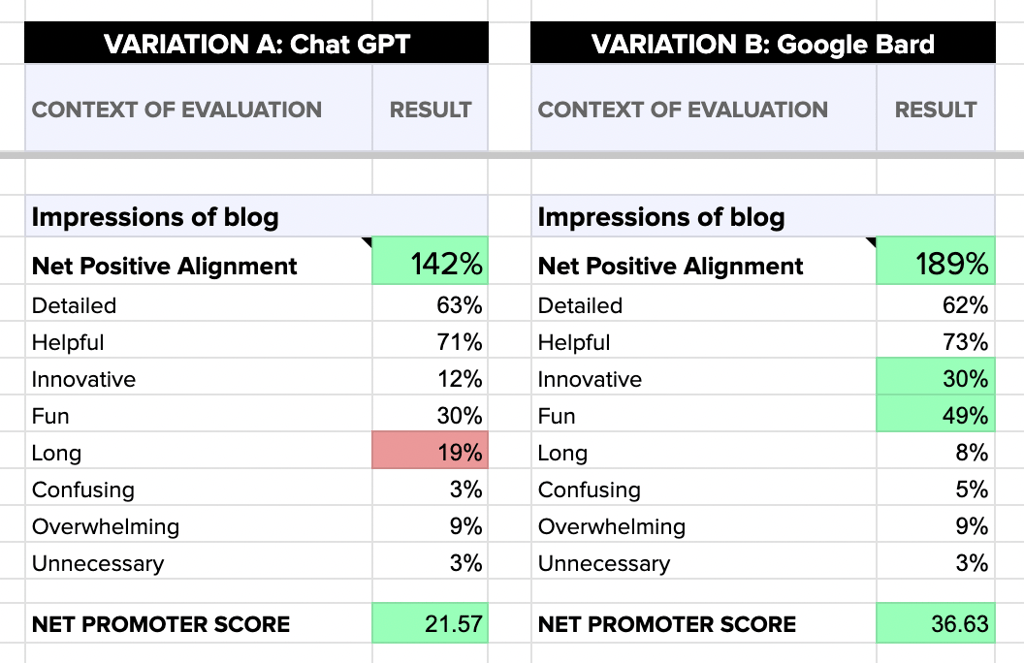
Net Positive Alignment can be a useful relative measure of personality and tone when comparing your conversational UI to competitors or even testing new prototypes.
5. User Control
User control refers to allowing users to drive the conversation. It means giving users options, the ability to go back, correct mistakes, or ask for help. This principle is crucial for creating a user-friendly experience where users don’t feel trapped or frustrated by the conversational flow.
Key ideas:
- Flexibility: Allow users to drive the conversation and switch topics or tasks easily.
- Interruption Handling: Design your system to handle interruptions gracefully, saving the user’s place or context.
6. Accessibility
Accessibility in conversational UI design means ensuring that the interface is usable by people with various disabilities. This includes designing for voice input and output, screen readers, and other assistive technologies. It’s about inclusivity and ensuring the conversational UI is usable by an audience as wide as possible.
Key ideas:
- Inclusive Design: Ensure your conversational UI is accessible to disabled users, considering text-to-speech and speech-to-text capabilities.
- Multilingual Support: Support multiple languages if your user base is diverse.
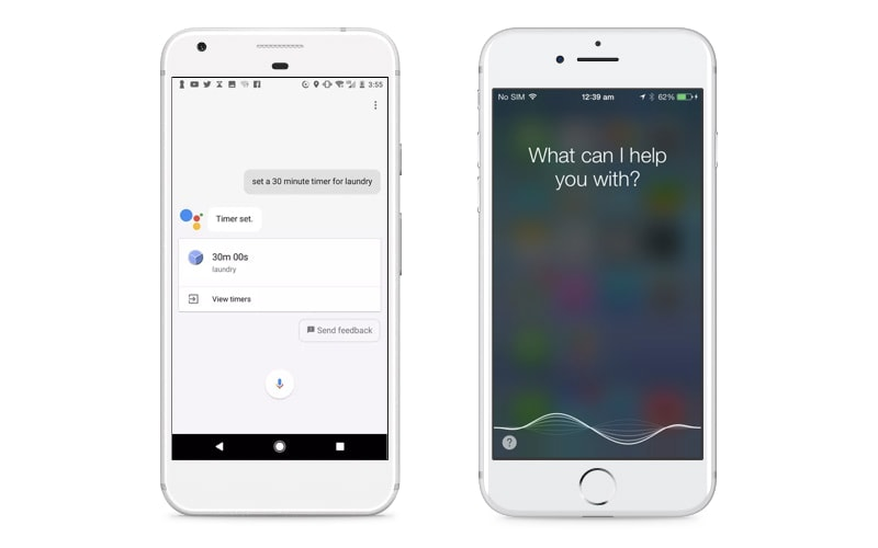
Siri and Google Assistant are examples of conversational UIs that are voice-accessible instead of purely text-based. You can ask either one questions and tell them to do all sorts of things. While Google Home or Amazon’s Alexa have similar voice-enabled capabilities, neither has an interface you see.
7. Performance and Scalability
This principle focuses on the technical aspects of conversational UI, ensuring that the system performs efficiently and can scale to accommodate many users or complex queries. It involves optimizing response times, ensuring reliability, and planning for potential user base or functionality growth.
Key ideas:
- Speed: Ensure responses are generated quickly to maintain a natural conversation flow.
- Scalability: Design your system to handle large numbers of users and interactions.
8. Privacy and Security
Privacy and security are critical in conversational UI, especially when handling personal or sensitive information. This involves implementing measures to protect user data, ensuring compliance with privacy regulations, and building trust with users through transparent privacy policies and secure practices.
Key ideas:
- Data Security: Protect user data and ensure compliance with privacy regulations.
- Transparency: Be transparent about data usage and provide options for users to manage their data.
9. Testing and Iteration
Testing and iteration involve continuously evaluating and improving the conversational UI. This includes user testing to gather feedback, analyzing interactions for points of confusion or failure, and making iterative changes to enhance the user experience and performance of the system.
Key ideas:
- User Testing: Conduct extensive testing with real users to identify areas for improvement.
- Continuous Improvement: Use feedback and data to refine and enhance the conversational experience continually.
Using a testing framework: HEART
The user experience team at Google developed the HEART Framework, which is a collection of metrics that allow you to assess the quality of a product’s user experience. “Happiness,” “Engagement,” “Adoption,” “Retention,” and “Task Success” make up the acronym HEART—each representing a distinct aspect of user interaction and satisfaction. This framework turns subjective user experiences into measurable data, empowering teams to make data-driven decisions and enhance their products.
Here’s how Helio was used to put the Heart framework to the test using two competitor conversational UIs, ChatGPT and Google’s Bard AI.
Happiness
After interacting with the product, participants are asked to indicate how they feel about the experience from a selection of positive and negative reactions. Net Positive Alignment, the sum of those positive reactions minus the negative, and Net Promoter Scores are used to gauge user satisfaction.
In our conversational UI example, we asked users how they felt about AI-generated responses from both ChatGPT and Google Bard. We found Google Bard had a higher NPS (36.63) compared to Chat GPT (21.57), and Bard’s Net Positive Alignment is 189% versus Chat GPT’s 142%, illustrated in the comparison framework below. These figures indicate that users are generally happier with Google Bard.
Engagement
Listen to what users say, but also watch what they do. With Helio, you can measure engagement with first-click tests. This generates quantifiable behavioral data that oftentimes contradicts user feedback.
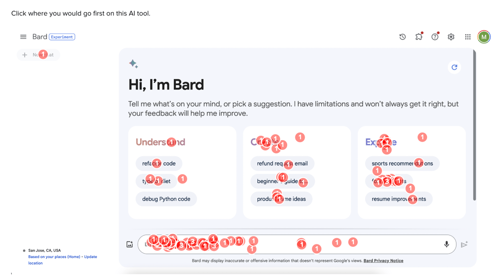
In our conversational UI example, we found user interaction with the command bar to be nearly equal across the two tools (about 60%). However, Bard’s layout drove over 3x more users towards command suggestions, detailed in the comparison framework below. For ChatGPT, this may be a signal in favor of increasing the amount of command suggestions, and providing more generalized topics for greater numbers of users to engage with.

Adoption
The actions of users after initial use give insights into the tool’s adoption. When there are a short list of priority actions for your team to track, presenting them in a multiple-choice question in a feedback survey produces quick answers.
In our conversational UI example, we asked our audience of home cooks a closed-ended question, “After receiving this recipe, what would you do next?” with five response categories:
- Regenerate new response
- Type in a new command
- Try a different AI tool
- Save and use recipe
- Other
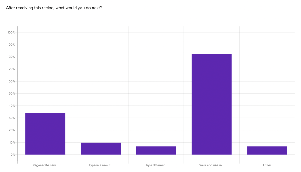
In this test, we found our sample of home cooks were more likely to try a different AI tool or type in a new command compared to Google Bard users, as illustrated by the comparison framework below. This could suggest that Chat GPT users are exploring the platform more, but it might also imply they aren’t fully satisfied with the initial results.

Retention
Participants will likely interact with the tool again after the first use. Although this is a highly subjective response, comparing the subjective likelihood of retention across two experiences can produce key signals for understanding successes and failures.
In our conversational UI example, we asked our audience of home cooks a five-point likert-scale question, “How likely would you be to use this tool again for finding recipes?” Below are the results from the Google Bard Test.
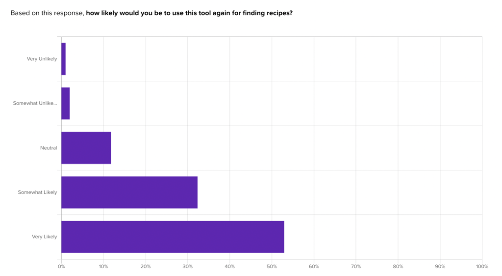
As the comparison framework below shows, Google Bard had a higher retention score, with 76% of respondents indicating very or somewhat likely to use ChatGPT again, and a full 85% of respondents indicating the same for Google Bard.

Task Success
While users are interacting with the experience, it’s important to note the success rate of completing their goals. In Helio click tests, primary actions, such as typing a command into the AI tools command bar, should show more than 80% of participants completed. Secondary actions should be at least 75%, and tertiary actions on the edge of the experience should reach 55%.
In our conversational UI example, we asked our audience of home cooks to click where they would go to ask for a Halloween snack recipe from each AI tool. Below are the results from the Google Bard test.
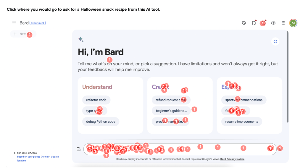
Findings from these tests suggest users’ ability to successfully utilize the command bar and suggestions determines task success. Google Bard boasts an 81% success rate, noticeably higher than Chat GPT’s 65%, detailed in the comparison framework below.

View the Helio Heart Framework Guide
Our data revealed signals that suggest Bard AI does a superior job of ensuring user engagement and positive reactions. ChatGPT can benefit from more concise responses that include more command suggestions, images for food-related results, and UI that indicates the current state for users.
10. Integration and Contextual Relevance
This principle is about seamlessly integrating the conversational UI into the larger ecosystem and ensuring it is contextually relevant to the user’s needs. It involves understanding the user’s journey, integrating with other systems or platforms as needed, and providing appropriate responses to the user’s current context and past interactions.
Key ideas:
- Integration with Other Services: Enable seamless interactions with other services or databases to provide more helpful responses.
- Relevant Content: Ensure the content provided is contextually relevant and up to date.
Designing User Interfaces for Diverse Devices
With conversational interfaces accessible across devices, designing for omnichannel compatibility is critical. Users may engage chatbots or voice assistants via smartphones, smart speakers, PCs, wearables, and more. Supporting diverse platforms with responsive design enhances reach.
Applying responsive web design principles allows conversational UIs to adapt across screen sizes and device capabilities. Flexible grid layouts, fluid containers, and media queries help create dynamic, device-agnostic interfaces. For example, chatbot interfaces can reflow column structures based on portable or desktop views.
Voice interface design must also consider usage contexts across devices and environments. Noise levels, privacy needs, and device limitations guide UX decisions around audio cues, confirmation prompts, and dialog strategies. Users may briefly engage a smart speaker at home versus having longer phone sessions.
Designing for versatility across interaction modes strengthens conversational UX. Choices like short/long confirmation messages or audio/text output balance convenience and context. Saving conversation histories in the cloud also enables seamlessness when switching devices. Overall, supporting diverse platforms with an adaptable interface remains key.
User Experience in Financial Applications
Conversational interfaces offer immense potential for the finance domain by simplifying complex tasks. Conversational AI can guide users through intricate processes using natural language for banking, insurance, and other services. Along with usability, building user trust is also crucial for successful adoption.
Streamlining finance applications involves understanding key user goals to simplify common interactions. For instance, online banking chatbots can allow users to check balances, transfer funds or get bill pay help through conversations. Eliminating lengthy form fills and menu navigations enhances usability.
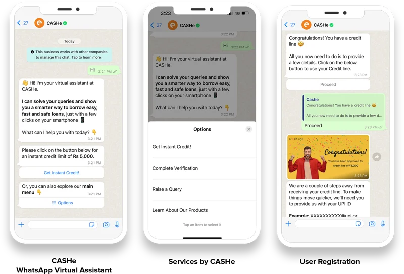
For example, CASHe is a leading credit-based financial wellness platform that enhances the borrowing journey for young middle-income consumers. It set out to use technology to provide hassle-free access to loans, helping people to have more control over their finances. CASHe’s product team also recognized that an automated and digital channel like WhatsApp could create a conversational UI to help provide sachet loans to millions of users.
Customers had access to instant credit lines without any wait time. Every lead was responded to promptly and efficiently, and back-and-forths associated with verification, document upload, and underwriting were streamlined while accelerating loan disbursement.
However, financial services also demand high user trust in the technology and security measures. Chatbots created by prominent banks inspire reliability through their brands, while startups necessitate trust-building design. Visual cues like bank verification badges and transparent AI disclosures foster comfort. Conversation cues also reassure users throughout interactions.
Overall, conversational finance apps must balance usability and trust-building. User-centric design tailored for target audiences simplifies daily money tasks through natural conversations. Accompanying trust assurance techniques cultivates user confidence and loyalty. When executed strategically, conversational interfaces can drive widespread preference for financial apps.
Implementing Conversational UI Features
Conversational user interfaces represent a paradigm shift from traditional graphical interfaces. While menus, forms, and buttons suffice for simplistic functions, sophisticated conversational capabilities require more advanced implementations. Core building blocks like chatbots and voice assistants enable complex dialogues.
Chatbots allow text-based conversations using natural language processing (NLP), the AI behind understanding human languages. NLP extracts user intents from messages to determine optimal responses, powering the conversational flow. Developers choose suitable NLP services and frameworks when building chatbots based on use cases and content complexity.
Voice interfaces take NLP further by recognizing and synthesizing speech. Speech recognition transcribes user utterances to text for processing, while speech synthesis converts system responses back to lifelike audio output. Combining speech capabilities with AI generates intelligent voice assistants.
Whether using chatbots or voice interfaces, conversational UIs demand well-designed dialog strategies. Maintaining context throughout conversations, asking clarifying questions, and recovering from errors should occur conversationally. The dialogue flows must align with user expectations for natural exchanges.
By blending AI technologies with UX-centric design, conversational interfaces create seamless user experiences. Thoughtful implementation decisions for crucial capabilities make these interfaces feel more intuitive and responsive.
Enhancing Interface Elements
While conversational interactions are the primary focus, supplementary visual elements enrich chatbot and voice app interfaces. As conversational UI matures, design trends bring interfaces beyond basic text and audio.
Vibrant illustrations, fluid animations, and interactive widgets help conversational apps convey brand personalities. Anthropomorphic avatars using lifelike images or 3D models strengthen character associations. Color themes and iconography also reinforce identities while modernizing aesthetics.
Dynamic conversations can animate avatars, user messages, or other components for visually engaging experiences. Subtle motions signify typing, processing, or loading contexts between exchanges. Animations also guide users, highlighting important areas or transitions.
Information-rich widgets further enhance utility for complex use cases. In travel booking chatbots, interactive calendars simplify date selections. Financial assistants can leverage data visualizations to illustrate insights. Inline frames also embed external content within conversations.
Thoughtfully augmenting core conversational experiences accelerates innovation in the field. While natural language remains pivotal, supplemental visual and interactive elements upgrade contexts, utility, and enjoyment. Conversational UI design continues maturing through these multilayered enhancements.
Performance Optimization for Conversational Interfaces
For conversational interfaces, high performance is crucial for responsive interactions. Laggy systems severely impact user experience – especially for time-sensitive requests. Optimizing speed by minimizing resource usage and data loads keeps conversations flowing smoothly.
As chatbots and voice apps may process heavy modules for NLP and ML, optimizing any media passed around improves efficiency. Images should compress file sizes without losing quality. Audio clips likewise minimize byte counts. Videos transition to streaming only when played.
Lazy loading delays non-critical resources until needed, accelerating initial launch times. Low-priority assets only load if users navigate to their features. Similarly, conversational apps can prioritize primary user paths, caching those responses for quick delivery while generating secondary routes just in time.
Caching also boosts performance through saved computation. Repetitive requests reuse existing data rather than recalculating outputs by storing previous complex ML model outputs or API call results. Edge computing processes frequently repeat tasks on decentralized servers to offload core infrastructure.
Optimization should address conversational bottlenecks for maintainable high-performance systems while keeping code modular. Clean components isolating key functions also simplifies replacing inefficient elements. The ultimate goal is maximizing speed without compromising capabilities.
Accessibility and Regulatory Compliance in UI Design
Designing conversational interfaces for global reach requires accommodating diverse users and environments. Beyond basic usability, truly accessible design considers those with disabilities and the elderly. Similarly, complying with international regulations gains trust and authorization to operate across markets.
Accessible conversational UI benefits users with vision, hearing, mobility or cognitive impairments. Screen reader support, captions for audio content and keyboard shortcuts aid those needing assistive tools. Clear writing and audio also assist users with reading difficulties or non-native languages. We mentioned it above, but it’s worth showing again, Google Assistant and Apple’s Siri are two examples of accessibility and regulatory compliance in UI Design.

Moreover, data security and privacy regulations must shape technical decisions. Permissions, user controls, and transparency aid legal compliance and responsible AI principles. Geographic-specific regulations further necessitate adjusting interfaces, especially when collecting personal data.
Inclusive design produces the most robust and ethical user experiences. Rather than retrofitting accessibility, embedding it from the start allows for more considerate engineering decisions around information architecture and interactions. Similarly, designing for compliance gives developers helpful, creative constraints.
As conversational AI spreads worldwide, keeping usability, accessibility, and regulations central bolsters responsible innovation. Users get services most attuned to their regional laws and individual needs. Overall, these measures future-proof offerings at scale.
Challenges and Solutions in Multilingual UI
Juggling the needs of global users makes multilingual support in conversational UI uniquely challenging. Many factors impact accuracy and reception across markets, from writing for localization to managing meaning across dialects. Strategic design and engineering decisions aid effective cross-language experiences.
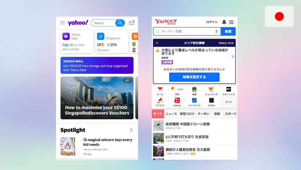
For example, look at the difference between this Yahoo screen’s English- and Japanese versions. Notice how the Japanese version features a microphone icon to encourage users to use voice-to-text in search queries.
Localization workflows involve extensive adaptation of textual content. Professional translators ensure accurate translations while editors tailor terminology and phraseology for regions. Glossaries mitigate issues stemming from words carrying different connotations across languages. Review processes give native speakers opportunities for input.
Conversational UIs also deal with vastly different dialects spanning geographies and generations. Along with standard vocabularies, incorporating colloquial inputs younger demographics use improves comprehension. Expanding language models with diverse training data helps handle informal utterances.
Testing is indispensable for multilingual UI quality. Alpha simulations with translators uncover translation issues early. Staged beta deployments to native speakers allow the collection of real-world linguistic data at scale to enhance models. Continuous tuning post-launch improves precision for higher user satisfaction over time.
Overcoming language barriers bolsters global experience parity in conversational interfaces. With thoughtful design and engineering adjustments, the technology can effectively serve users regardless of their native tongue. The result is more accessible and widely relevant solutions through language for all.
The Future of Conversational UI Design
Conversational user interfaces continue rapidly advancing with emerging technologies and discoveries. As artificial intelligence, machine learning, and natural language processing mature, more futuristic capabilities will shape conversational experiences.
Key innovations around predictive modeling and personalized memory networks point to more context-aware, intelligent systems. By recognizing individual users and learning their behaviors over time, future conversational apps can preemptively cater to user needs through proactive suggestions and recommendations. Persistent memory of conversations and preferences also enables continuity across long-running dialogues.
Multimodal interfaces blending several input and output channels hint at a more versatile conversational future. Users may soon toggle seamlessly between voice and text exchanges with assistants, using the mode most fitting for particular moments. Inputs could also eventually encompass gestures and gaze behavior sensing alongside speech and text as mutually supportive mechanisms.
Overall, innovations rest on expanded, longitudinal data pools for better discerning the elaborate nuances within human conversations across diverse groups over time. With growing access to transparent, ethical data to train ever-improving algorithms, conversational AI aims to replicate human intelligence for more meaningful human-computer interactions.
Conversational user interface design and beyond
Conversational user interface design has the potential for groundbreaking impact across applications and industries. Reimagining software beyond static graphical interfaces, these conversational interactions promise to make technology feel more intuitive, responsive, and valuable through natural dialogues. The emerging field also imparts immense opportunities for user experience designers to shape future human-computer relationships.
By aligning design around meaningful conversations instead of transient tasks, UX specialists can pioneer more engaging, enjoyable, and productive technological experiences. User expectations and relationships with tech evolve from transient tool consumers to interactive, intelligent solutions fitting seamlessly into daily life.
Designers bear great responsibilities in guiding user adoption and the continual advancement of conversational interfaces for the betterment of businesses and their customers. With sound ethical foundations and innovation mindsets, forward-thinking UX practitioners will unveil the next era of conversational interfaces. Talk to an expert to learn more about implementing a conversational UI in your product.
Conversational UI Design FAQ
Conversational UIs allow interactions through written or voice conversations using natural language processing to understand user intent and respond conversationally.
Conversational UI uses natural language processing (NLP). NLP is the AI technology that powers the ability of computer systems to analyze and process human languages to determine meaning and respond appropriately.
Examples include chatbots for text-based conversations and voice assistants like Alexa, Siri, and Google Assistant for speech conversations. A chatbot is a computer program that conducts conversations with users via text messages to assist them with tasks or provide services.
Key principles include user understanding, clear communication, user guidance, personality/tone, user control, accessibility, performance, privacy/security, testing & iteration.
To serve global users, conversational systems must accommodate diverse languages and dialects through localization and ongoing language model tuning.
Future innovations include predictive modeling for proactive suggestions, persistent memory of user contexts across conversations, and multimodal input/output.
Key techniques involve minimizing resource usage, prioritizing user paths through caching, lazy loading non-critical components, and isolating functions into modular components.
Considerations for disabilities include screen reader support, captions, keyboard shortcuts, clear writing, and easily readable content.


