Case Study
Q4 Inc. Navigation Update
Validated the most effective navigation for Q4’s website using card sorting.

Q4’s baseline nav was underperforming
Almost no pages were successfully sorted into the current top nav categories.
Reducing to 3 primary menus improved participant reactions
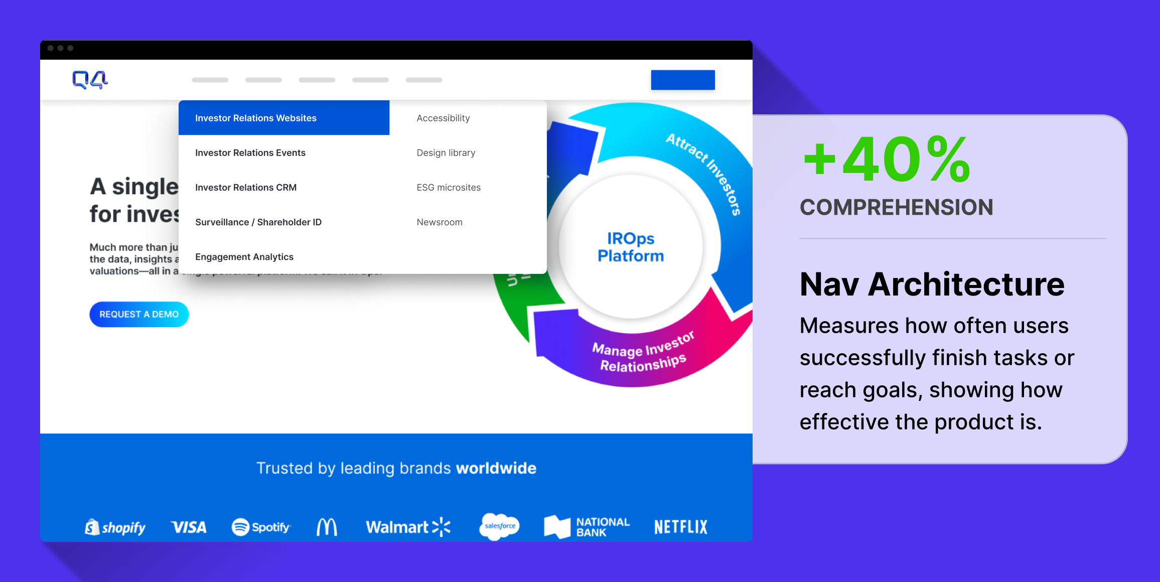
40% more content pages were successfully sorted into their expected categories.
About Us category performed better than Resources
About Us does not distract from more important content like Resources does.
Business Challenge
Q4 Inc., a leading provider of investor relations solutions, faced challenges in website navigation that potentially affected user engagement and content discovery. The main issue was to determine the most effective navigational structure to facilitate easier access to critical investor relations content, thereby improving user satisfaction and engagement metrics.
Timeline
The study was conducted over a two-week period, providing ample time for iterative improvements to the navigation architecture and testing processes.
Research Goals
The primary research objective was to identify which navigation structure best supports the discovery and interaction with essential content areas such as the Q4 Platform, Company information, and Resources.
Methodology
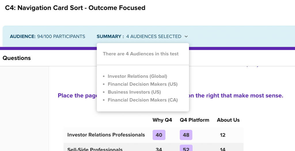
We used a card sorting technique combined with Helio’s remote user testing capabilities to assess navigation expectations across 5 different versions of pages and categories on the site.
Research Panel
We used a Helio audience of Undergraduate, Graduate, and Prospective College Students in the US.
Test Setup
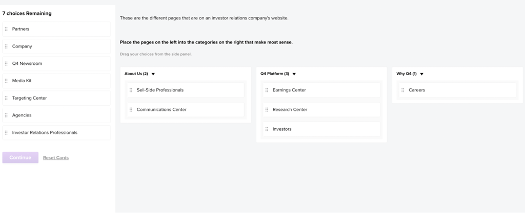
Participants were asked to sort the 14+ key pages on the site into 3-5 categories so that we could understand where they naturally expect to find those pages on the site:
Analysis and synthesis
Q4’s baseline nav was underperforming
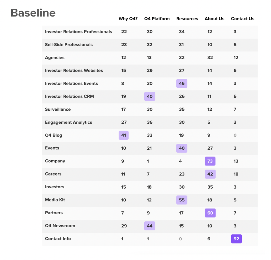
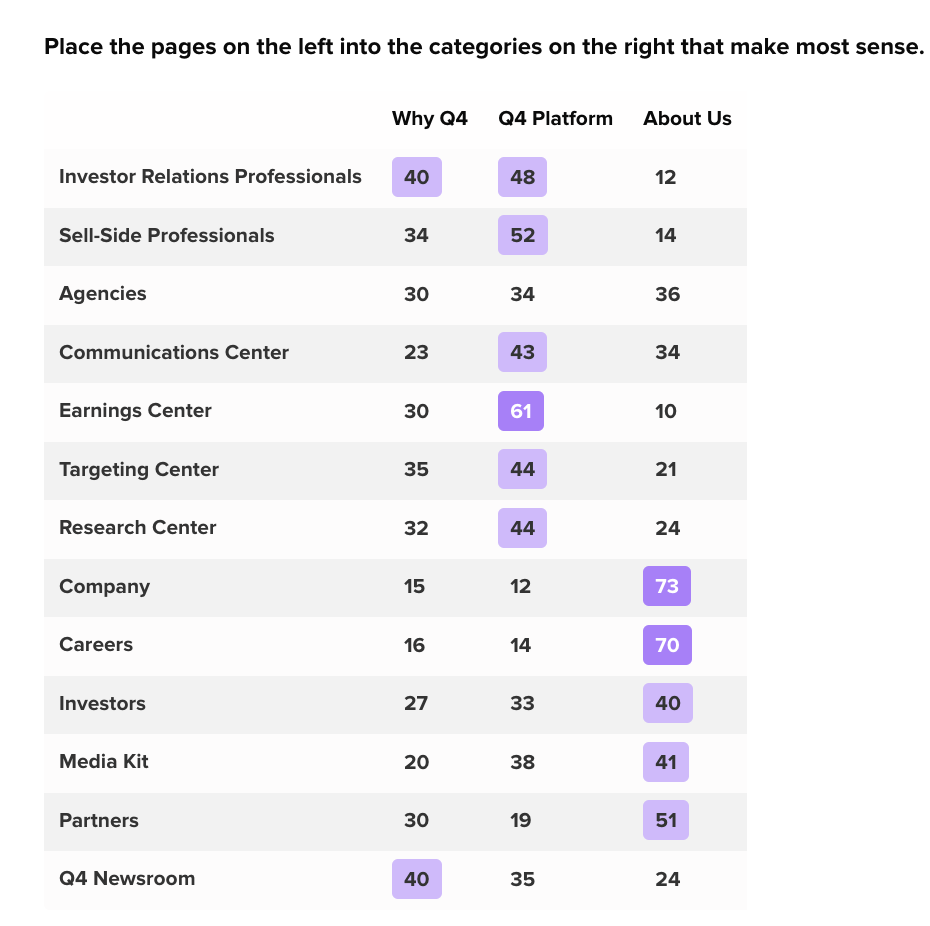
Almost no pages were successfully sorted into the current top nav categories. We found that having 5 categories resulted in only 4 out of 17 pages being properly sorted. The category that needed to see the most improvement was Q4 Platform because it holds the bulk of valuable information on the site.
Reducing to 3 primary menus improved participant reactions
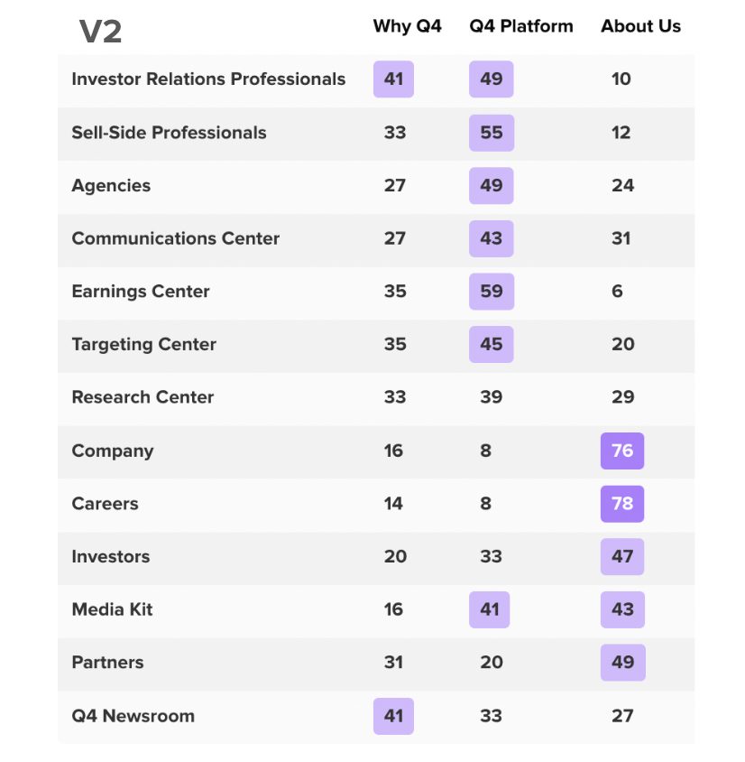
Up to 40% more content pages were successfully sorted into their expected categories. With version 4 of the navigation, we found that participants were much more successfully sorting pages into the Q4 Platform category, and also expected even more content to live there.
About Us category performed better than Resources
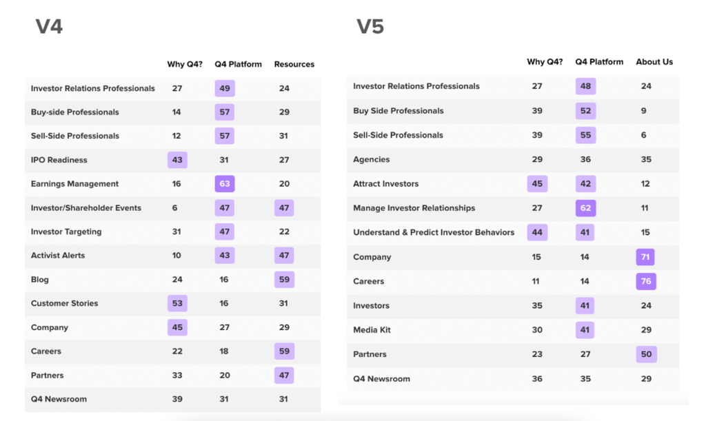
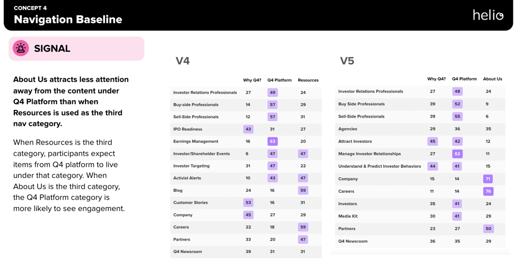
About Us does not distract from more important content like Resources does. With one final attempt at a version 5, the navigation performed very similarly to version 4. However, we determined V5 to be the better business decision because it indicated that users would be more likely to explore Q4 Platform for certain content rather than skip straight to Resources (as they would in V4).
Outputs/Deliverables
The data from our card sort tests was reflected in Helio’s data report:
We extrapolated this information in order to compare across versions of the nav in our executive decks:
Impact
The insights from this study led Q4 Inc. to adopt Version 5 (V5) of the navigation, which:
- Enhanced user engagement with key content areas.
- Improved user satisfaction and ease of navigation, potentially leading to higher retention rates.
Next Steps and Recommendations
Following the outcomes of this study, the following recommendations were made:
- Implement Version 5 (V5) across the Q4 Inc. website.
- Conduct follow-up studies to refine and optimize other secondary navigation elements.
- Evaluate the long-term impact of these changes on user behavior and site performance metrics.
Reflections
This case study demonstrated the effectiveness of remote user testing in real-world applications, specifically in refining website navigation to better meet the needs of target user groups. It also highlighted the importance of iterative testing and customization in achieving optimal user experience and engagement on digital platforms.
