Proximity
Proximity is the practice of using space to make certain items appear related.
![]() Morgan McGowan
. 5 min read
Morgan McGowan
. 5 min read
The nuts and bolts: Proximity implies that items that are close together are regarded as a unit. Related content is displayed near together on your web page or on your profile, forming a visual unit.
Take a series of items in a design or illustration. Move some of them closer together. Leave noticeable gaps between others. The close elements will seem to be related. This is the principle of proximity.
We use proximity in interface design to group like items: different levels of navigation, for example.
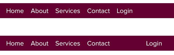
Above: The two navigation bars give different priorities to the login button. The top example indicates that “login” is a section of the site, on equal terms with home, about, services and contact. The bottom example pushes “login” away, subtly indicating that it’s not part of the public areas in the site.
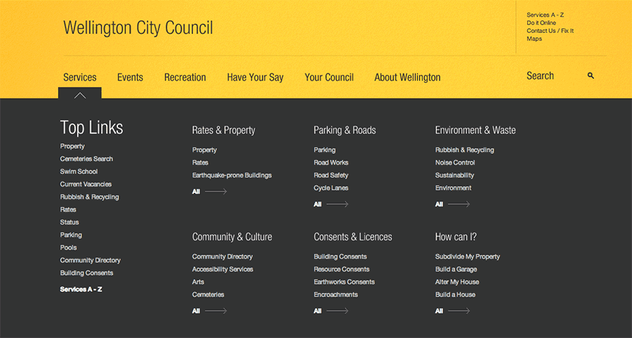
Above, the Wellington City Council’s website separates links with different functions — search and nav links, top links and sub-links — with space.
Proximity relies on having space to work with, so it’s less likely to see on mobile devices. But it’s a great way to organize items without using lines, decoration or bits of clutter. Space is easy for users to figure out at a glance. Just take a series of items — and break them apart.
Check your proximity with our Helio Test Template: