Modular Scale
A tool that helps to build consistency, harmony, and rhythm in your designs.
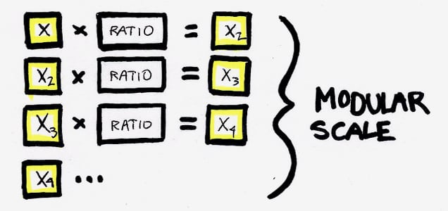
The nuts and bolts: A modular scale is a set of numbers that are meaningfully related to one another. By multiplying by 1.618 to get the next highest number, or dividing by 1.618 to get the next lowest number, we can get numbers for a modular scale using the golden ratio.
What would a world without scales be? Music would not make sense. Indiana Jones would have to be deathly afraid of some other animal class. But most importantly, we would have no way to measure or represent ratios.
We believe Robert Bringhurst was on point when he wrote in his book, Elements of Typographic Style”:
A modular scale, like a musical scale, is a prearranged set of harmonious proportions.
Bringhurst’s quote is a succinct analogy as to what a modular scale is, but what are they used for? These modular scales are quite practical for the ever evolving world of responsive web design, also read: grids.
The harmonious modular scales are used to create consistency throughout your web design. This creates harmony for users by diminishing or expanding key elements of your page — whether typography or clickable regions of a page — through a ratio. These gradual increases or decreases to your site’s elements, which are determined by mathematical computations (which we will look at later), create meaning and rhythm in your design.
The rhythm and consistency to your site’s elements, created with the use of the modular scale, is far more time-efficient and aesthetically pleasing than working with arbitrary numbers pulled out of the air and then attributed to the elements.
Modular Scales at Work
To begin working with the modular scale you should begin by thinking of a base number, usually thought to be your ideal text size, then your ratio number.
Tim Brown mentions that the golden ratio, is said to have been found in everything from Greek architecture to the growth pattern of plants, which makes it one of the most widely known and often used ratios.
With this ratio, we can multiply, or divide, to our base number and find the next highest or lowest value that will create a nice uniform scaling. Once you decide on your base number, you need to think about another value or the important number. The important number can be anything you desire, whether it be the value at which text looks fine at its smallest, or a value at which you’d like to present your media.
As we previously discussed, mathematical computations were necessary for determining these values. However, if you’d like to make things simpler for yourself, Tim Brown developed a modular scale calculator. It makes this process a lot simpler. Simply enter the two values you’ve decided upon and the ratio which you’d like to apply to your design, there is quite a smattering of choices aside from the golden ratio.
We also mentioned that the modular scales could be implemented into your responsive web designs. This is true. But not as simple as just plugging your scaled set of numbers into your design. Almost but not quite. All you really have to do is set percentages to your modulated scale number set and … congratulations, you just scaled behind the wheel of the grid — responsively, of course.
Although we do not build grids with modular scales here at ZURB within the Foundation framework, we do however use the modular scale when working with the typography aspects of Foundation.
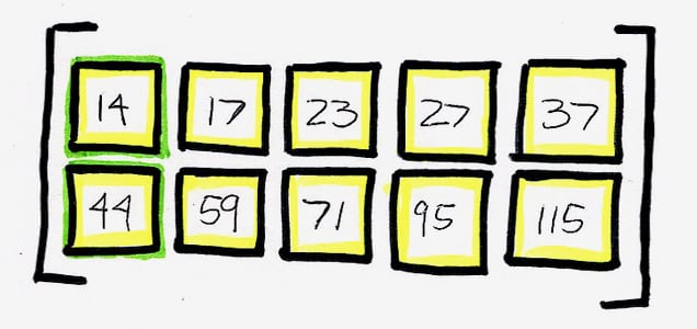
We began with our base number, which was 14px, due to it being a good size for body copy for a site. Then we looked at our second, important value, and settled on 44px. We settled on the second number because it has become the standard in being the smallest and easily tappable area for UI elements on small mobile devices — after all, we have to start thinking mobile first, right? Then by using the golden ratio, 1.618, we multiplied and divided our base and second numbers to find a set of numbers to use as our typographical sizes.
Scale the Mighty Seas of the Web
One last thought. Modular scales are another tool in your toolbox, which provides mathematically-scaled numbers for you to attribute to your site’s elements. However, by not exercising the use of this helpful and time-efficient tool, you are overlooking the very important presentation of beautiful and symmetrical rhythm on your site.


