404
Error pages are unsung opportunities.
The nuts and bolts: In internet speak, the 404 error page not found message indicates that the browser was able to interact with a specified server, but the server could not find what was requested.
Change happens. Designers might move to a new CMS that requires different URLs, tweak a site’s URLs to improve SEO, or simply remove outdated content. “Missing page” errors — code 404, to get technical — are an open secret of web design. Many users have stumbled upon bad URLs from invalid or outdated links that point to nonexistent pages. Chances are they’ve also run into default error pages that tell them little, except that they’ve hit dead ends.
And it’s true. Pages that don’t exist are dead ends, the 404 error page is the web server’s way of saying “I don’t know what to do” with a shrug of their virtual shoulders.
No fun and all work, make for boring 404 pages
Recently — say, after the early 2000s — designers began to see 404 pages as an opportunity to express a little whimsey. Set apart from a site’s “official” pages, error pages are a chance to can kick back and have a little fun, even create a bit of a wow factor.
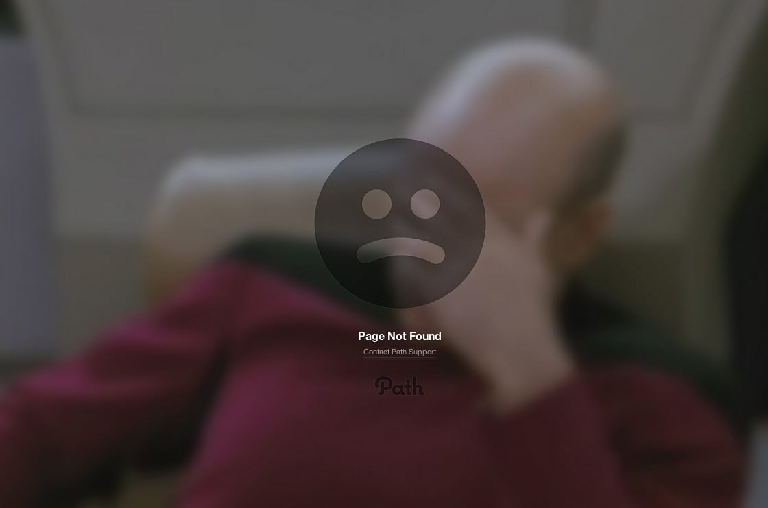
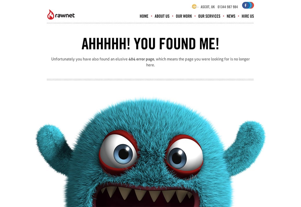
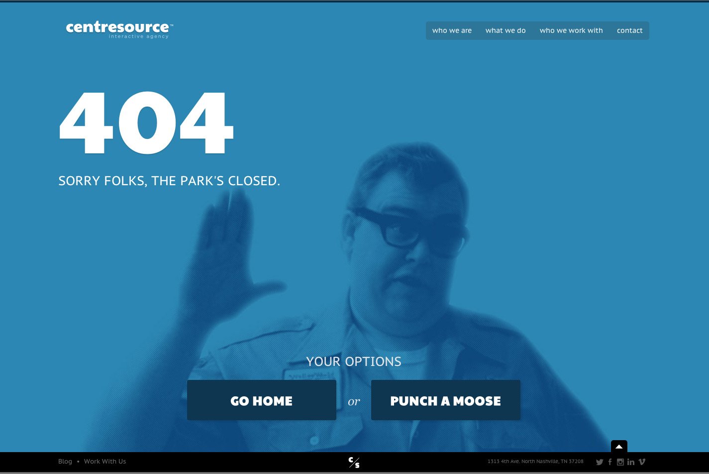
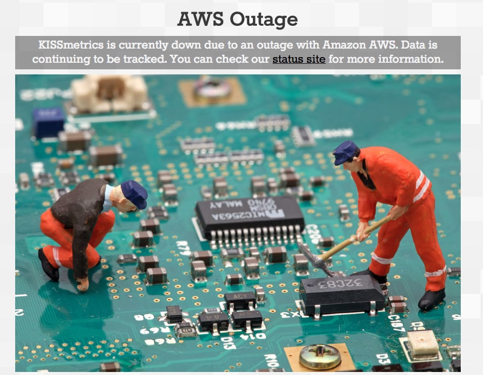
Entire articles and websites have been dedicated to showcasing creative 404s, like these:
We’ve also had fun with our “missing” page. But 404 pages can become more if you think beyond the obvious. They’re backup home pages.
The 404 Error Page is an Opportunity for Delight and Function
“Missing page” error pages may represent problems, but they don’t have to be unhelpful. If we approach 404 pages another way — as how people (accidentally) arrive at a website, 404 error pages aren’t dead ends. They’re alternate landing pages. They’re search tools. They’re introductions. Truth is, they can be many things. Options include:
1. Automatically send users to valid pages.
Of course, the smartest strategy for 404 pages is to prevent users from seeing them. 301 redirects to prevent people from hitting 404 errors when you change URLs. While 404 pages simply say “this page doesn’t exist,” 301 redirects tell browsers “this page doesn’t exist — go here instead.”
When we changed our Expo to University, we knew many links outside zurb.com would still point to zurb.com/expo. To handle old links, we told our server to automatically send people looking for zurb.com/expo ahead to zurb.com/university. Google has an overview of 301 redirect code, and Moz provides a tutorial on how to write the code correctly.
2. Think of the 404 error page as an alternate homepage.
People who follow invalid links from other websites may be visiting your site for the first time. Creating a good first impression is important because the fact that they followed a link — even a bad one — shows they’re interested.
Include a quick introduction to the site — its topic, goals, and even what the user will not find. For example: “This design portfolio shows the finest collection of yeti art on the web. But if you’re looking for yeti stock images, we suggest iStockPhoto.”
Describe major sections of the site, just as you would on the homepage, to help people decide which pages will have what they’re looking for.
Finally, give users a chance to interact with the site by providing a site-wide search or “report an error” page. Forms will help them feel like they’re not lost and helpless. Bad links aren’t dead ends. 404 pages don’t have to look like mistakes, and they shouldn’t act like errors. Maybe we can’t avoid change, but we can take steps to make our products thorough.
