Visual Weight
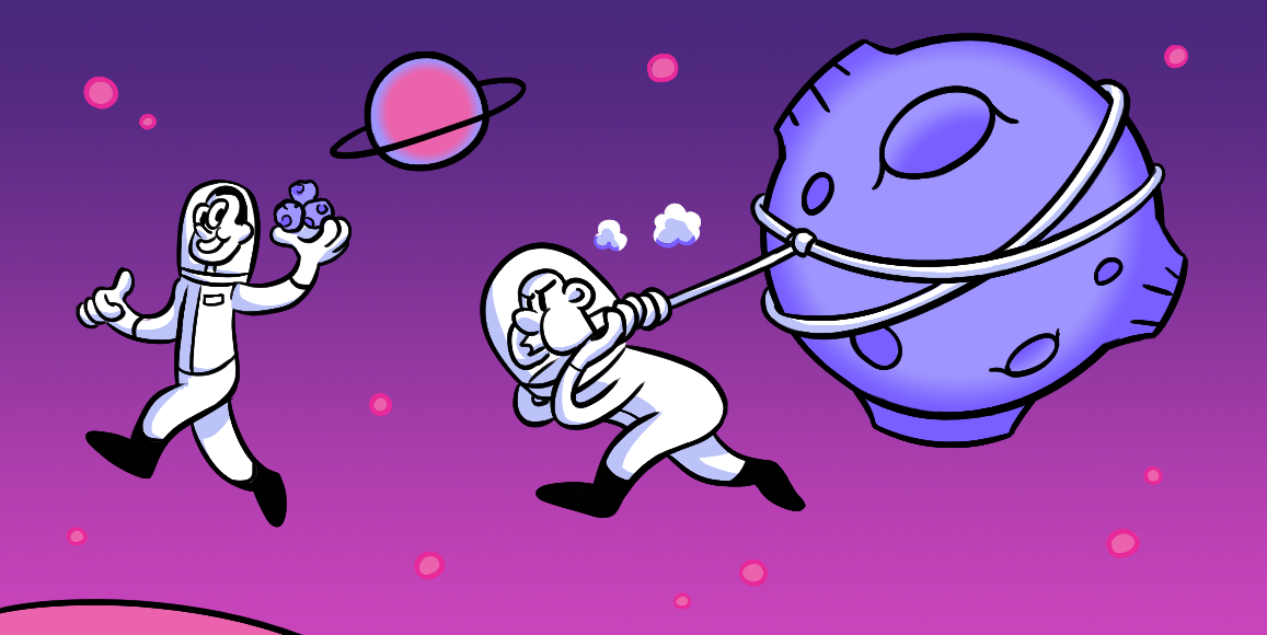
Building balance with the use of contrasting elements.
The nuts and bolts: The visual weight of an image is described as the visual force that arises as a result of light contrast among the visual elements that make up the image.
You’ve just created a page to the best of your abilities. But you can’t seem to put a finger on why your eyes gravitate toward an element that isn’t what you want your user’s primary focus to be on. You’ve tried reworking the hierarchy, you have the right calls to action in place and crafted effective negative space. Yet, your eyes still land on that one darned element. In this case, your page may be suffering from unbalanced visual weight.
The purpose of visual weight, in design, is to balance out how the user will view your page. By properly managing six characteristics of elements, you can achieve balanced visual weight. These characteristics are: color, contrast, lightness/darkness, size, density and complexity.
However, these concepts can be quite subjective in nature. As a designer, you have to use your intuition as to how the users will decipher these characteristics and how the eye will be drawn to, or from, these elements. We can retool the page. We have the technology. We can achieve balanced visual weight.
In Living Color
Back in the 90’s the Hypercolor clothing line definitely grabbed your attention. Those insanely bright and gaudy garments, no?
In terms of visual weight design, those colors would not have much weight, meaning they may not garner the same attention in the world of the web as it did in the 90’s.
Putting a value on a certain color weight is impossible — this is where your design intuition comes into place. Generally the lighter a color is perceived, the weight is perceived to be light as well. Hence, darker colors would be seen as heavier.
Intuitive weight attributions can be difficult when you start to compare colors like red and blue, the subjectivity of which color is heavier becomes a neck-and-neck race.
The elements that you want users to focus on should be utilizing heavier colors in your design. Whereas supporting elements should be lighter to the eye.
Turn that Contrast Up
Going back to our Hypercolor shirts, when you applied some heat to those bad boys the colors would change, causing some sweet contrast. When you put lighter colors near darker colors, your eyes will instantly be drawn to the variations. The more intense the contrast, the more attention it will capture.
The impact of contrasting between background and foreground is immense. The more contrast you can create between the element and its background, the heavier the element will become.
The more important an element is to your overall design and purpose of your page, the more contrast it should get. A call to action should be the highest contrast of your page.
Come to the Darkside. We have Heavier Values.
Darkness and lightness can give your elements a weight value. This characteristic of elements is pretty self-explanatory. Heavier objects are often viewed as being darker. Hence, the darker the object the heavier it will be perceived.
Because heavy objects, in nature, are usually on the bottom it is more natural for a user to want to see darker elements towards the bottom of a page rather than higher up — this is mentioned in the article linked earlier.
Macro or Micro
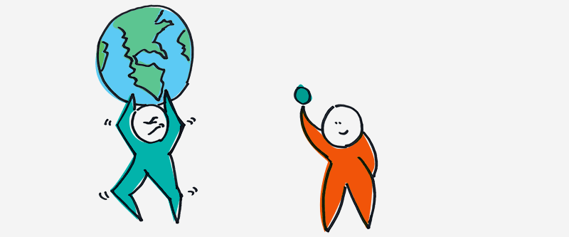
Size is quite a self-explanatory characteristic, in terms of weight and balance. The larger the object is — even if it’s two of the same object — the heavier it will be perceived.
To offset a larger element and attain balance, you will have to use a number of smaller elements to even out the weight differential. Think of yourself as Lady Justice, you want to even the scales to achieve balance among your people … er … users.
“I’m Your Density … “
Density is a characteristic of visual weight that is a strange beast — a double-edged sword. A more dense and compact element in comparison to a more dispersed element will have the appearance of more weight.
The dual nature of this density comes from trying to balance the characteristic. When dispersing a dense object, in order to balance against another dense object, you may be creating more contrast. In turn, creating another imbalance.
When using dense elements, you have to make sure that you carefully offset and balance the page with a conservatively less dense element, as to not have too much negative space creating such high contrast to pull the user away.
Complexity Doesn’t Have to be … well … Complex
Our last characteristic of visual weight, complexity, is quite similar to density. The more complex and varied an element is in its entirety, the more time the user’s eye will sit on the object, giving it more perceived weight. And to balance the complex element, you need to have a similar watered-down element.
This could be used in the instance of a call to action that has a primary and secondary option. The primary may be your more complex element, where the secondary would be a watered down variation. By doing this, the user would focus on the primary call to action element.
Shift their Eyes to What’s Important
We’ve discussed each of these concepts in length, but it’s time to see them in action. Let’s take a closer look at a previous ZURB.com landing page and see how the concepts were applied to our own designs. Click on the image to peruse the annotations.
“This is Heavy.”
When Marty McFly found things to be “heavy”, it was usually things or events that helped us gain insight to the storyline, did they not? The heavier, the more interesting. The heaviness created greater conflict and captured our attention. It had us on the edge of our seats. The same goes for visual weight.
Once we understand the concept of visual weight, we can understand why certain elements may acquire more attention over others. It’s not necessarily the hierarchy or the negative space that leads the user’s eyes around the page.
By managing the color, contrast, lightness/darkness, size, density, and complexity you have all the necessary tools to build a well-balanced product.
With effective management of the visual weight or elements, you can build a site where the difference is between a clean balanced page and a page with unbalanced and unnecessary attention grabbers.
