Sketching
A design method that helps us quickly get ideas out there, work through problems, explain interaction, and build products.
The nuts and bolts: A sketch is a quick and rough drawing that provides a summary or broad outline of something. Sketching is a short freehand drawing that isn’t normally intended to be a final product, but it’s a fantastic tool for designers to quickly conceptualize various design possibilities.
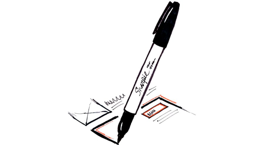
Some of the best ideas start as sketches. Doodles on the back of a napkin and ideas scrawled on an envelope are responsible for hundreds of things we take for granted. This isn’t an accident — there’s something special about a sketch. Which is one of the reasons we sketch.
We sketch almost as a habit. More often than not while we’re discussing something we’ll start fumbling for a piece of paper and a sharpie, or hunting around for a marker and some empty space on one of our whiteboards. Sketching helps us clarify ideas and get buy-in on concepts, and however much sketching you’re doing, you should probably be doing more.
What is a sketch?
A sketch is more than just a drawing — it’s a representation of an idea that is shown with a specific amount of detail, for a specific purpose. The medium can change: sharpie on paper, pen on a napkin, whiteboard markers or even digital sketches are all perfectly viable. What makes a sketch more than just a drawing is what you show, and how you show it.
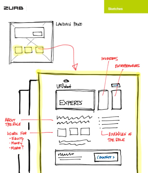
Consider this sketch. What we’re showing here is more than a simple page layout, though that is part of it. We’re also showing how three pages are related to their joint landing page, highlighting their origin on the landing page layout, supplying notes about the content and giving a sense of the likely action. There’s some components to this sketch that we’ll use as just one example of how to do a sketch.
Details, Details, Details
There’s a reason why we prefer to sketch with a sharpie, and not a pen — it limits the kind of detail we can get into. Ever tried writing a paragraph of text with a sharpie? Don’t, it sucks. By sketching with a broad point (this is the same in digital sketching), you free yourself from having to worry about specific details. That’s good, because sketching is not about details.
When you sketch, your aim should be to communicate a process, or an interaction, in a general way. You’re not looking for feedback on body copy or iconography, things better represented as a content draft or visual design. You’re looking for feedback on whether something works at a higher level, and whether you can communicate the intent without relying on detailed crutches. Keep your detail low, and use it carefully.
Color
One thing you can’t do with just a sharpie is make use of color, and color can be very valuable. Nothing quite communicates a link like blue text, whether that’s on a screen or on a sketch. Our toolbox for colors when we’re sketching tends to be:
- Black, for the structure and content
- Blue, for links or actions
- Yellow highlighter, for things the viewer should note or that need to stand out
- Red, for notes that are not part of the sketch itself
Don’t get crazy — having a kaleidoscope of color on your sketch just means no one will know what to look at or where to go.
The Canvas
The last thing you’ll need before sketching is a canvas. Unlike mockups and wireframes, which are typically self-contained pages, sketches are extremely free-form. You can sketch multiple pages on one sheet of paper and show the flow between them. You could sketch out a main screen, then just sketch out the states of a particular moment. The only restriction on you is the space available and communicating your intent.
Who should be sketching?
You should. Sketching is not the exclusive purview of “designery” types, or product guys, or artsy people in berets. The beauty of sketches is that anyone can use them to better illustrate an idea or a problem.
At ZURB, designers use sketches all the time to show interactions, ideas, layouts, or flow. Engineers might use a sketch to show IA, or architecture, or an interface element, or a support issue. We’ll use sketches at a strategic level to show how our clients could be approaching their market, and how ZURB evolves as a company. Sketches are endemic to our culture and are used by anyone to communicate ideas.
It’s not enough, though, to just sketch. You need to know what the goal of your sketch is, and how to achieve it.
What should you get out of a sketch?
Knowing how to sketch, and what pieces are available, is only the easy part. The hard part is understanding what you’re sketching for, and what you need to get out of it. Sketching, in this respect, is no different than any other design method: you need to be focused on your delivery, obvious in your intent, and clear about the feedback you expect.
Who should see a sketch?
Not everyone. Repeat after me: not everyone should see a sketch. Sketches are a single tool among many and they are not ideal for all people. Consider the CEO of a company you’re consulting for — they may be very opinionated about how their product works or is positioned, and you might think “well, I’ll just sketch it out and show him to get feedback early.” Careful! Someone in that position may be used to either mockups or prototype code, and they won’t know how to respond to a sketch. “What’s this line mean” or “what does it say here” are not questions you can confidently answer based on a sketch.
You also need to be careful about using sketches for testing with customers. Sketches can be used this way, and we often do when we’re concept testing but consider that not everyone who sees a sketch will understand the bigger picture.
They may not understand what they’re giving feedback on, or how they’re supposed to interpret the sketch. Be very careful about how you position your sketches, and how clear you are about the feedback you expect, in order to get value from sketch testing.
When you show sketches, show them to people who are able to give you the feedback you need. Show sketches to people who are able to understand your intent, and what your goals are so they can help you meet them.
What am I trying to say?
Sketches are powerful, because they can paint a picture of a design where the viewer fills in all the blanks. Show someone a sketch of a streaming video service and boxes become movie covers, squares become avatars, and squiggly lines become titles, or reviews. This is a two-edged sword, however, because if you aren’t clear about what something should be, viewers will pretend it’s something else.
When you’re sketching, understand that there are various patterns people are used to seeing. If you have a byline in a social service (blog post author, reviewer, friend) you should know that a box like this:

… means “person” or “user.” A square with lines crossed through it usually means an image, and a single line under it usually denotes a figure. People understand these conventions and they will help you communicate what you want.
Your sketches should also communicate flow and focus. If you have an action the user needs to focus on, make it clear! Highlight it, spell out what it says, and give it a right arrow to show that it leads somewhere else. Then draw a small page that it leads to, draw a red line from the action to the small page and label why the user clicks on it. Be clear!
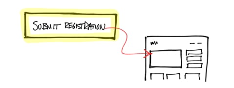
Sketches will help you immensely by shielding you from detail, but you need to help the viewer shield themselves from it as well. Don’t be coy about the focus and purpose of a sketch.
What do I want to get back?
Ever seen a user test go like this?
Tester: “Look at this screen. Tell me what you think.”
Customer: “Ummmm, uhhh … I think that’s a … uhhhh …”
I bet you have. Asking for unstructured feedback is a death blow to your process, and doubly so with sketches which are already ambiguous. When you’re testing a sketch, you need to:
- Provide the context (how did I get here)
- Provide the purpose (what might I be trying to accomplish)
- Provide an exit (what is the solution to the directive I’ve been given)
If you’re clear in the type of feedback you want, you’ll get the feedback you need to move forward. If you don’t … you won’t.
Consider our original sketch. We might ask people “what is this” and get back 100 different answers. We might get different answers from different contacts within the client (as has happened more than once). Instead, what we might ask is “Does this sort of hierarchy make sense for a marketing page geared toward three groups of users? If not, what would make it more clear for you?” Being direct in what we’re asking for gets us direct answers we can work with.
Sketch Early, Sketch Often
The things we’ve talked about here only work if you practice, and you need to practice a lot. There’s a subtle art to sketching that has nothing to do with how pretty they are, but has everything to do with how you do it, what you show, and what you ask for.
You can sketch using the first writing utensil and blank page you have at hand. Or you can opt for using sketch sheet templates with black or colored sharpies. You can use whiteboards (at ZURB we have 22), or you can use an app like Noteshelf on an iPad (or any tablet app) to do digital sketches. The important thing is to do a lot of it, and practice. Every time you need to sketch something, give yourself a goal: X sketches in Y minutes. We do this for new designers, even if sometimes we need a little motivation. Make it challenging. You won’t always hit it, but you will get faster and better.
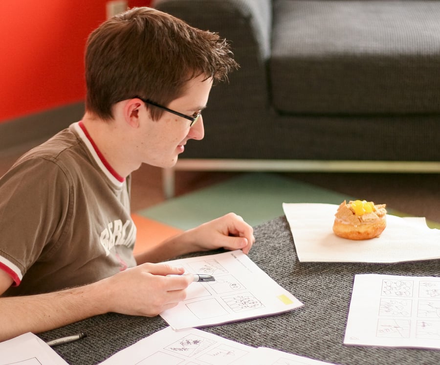
Sketching under a time constraint.
The tools you use, your medium, and who sees your sketches will change all the time. What’s important is to keep doing it, and keep practicing how you illustrate and iterate an idea. Think about your goals and make them happen. It starts with a sketch.
