
Mobility
Taking the world with you, wherever you may go.
 . 5 min read
The nuts and bolts: Mobile-friendly design implies that the information on your website — photos, texts, videos, and links – is easily and quickly accessible across all platforms, especially on the considerably smaller screens of smartphones and tablets.
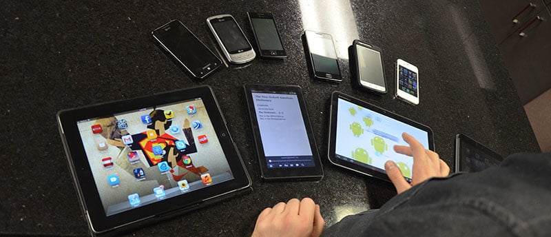
Mobility in the computing world is pretty straightforward and self-explanatory. The ability to make computing mobile, whether it be through the use of mobile phones, tablets, or laptops. Though there are a few key differences between each of these, such as operating systems and resolutions. One thing they all share together is their ability to access the web and its many components.
Because of this fact, we can’t just simply ignore the profound impact that a more mobile audience would have on our products. We have to evolve and adapt to the heavy increase of mobile devices accessing the web.
Mobility and the Internet
The ability to have web access is a fundamental staple of the mobile computing market. In turn, these web accessible devices have become an extension of us. We are slowly becoming more dependent on products to help manage our lives. This moves usability into higher priority when designing web-based products. With the vast amount of differing mobile devices, it’s crucial to make sure our products can work to their fullest extent on each and every web accessible device.
Responding with Responsive
There is one big hurdle in developing for the web with so many mobile devices on the market. We have to decide what the proper dimensions are for our products and how they will react for each device.
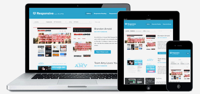
To throw you a curveball, the answer is actually found outside of what is being asked. We shouldn’t be working with a single static dimension size for our products. Instead, for enhanced mobility we need to design responsively. In the responsive mind-set we are designing products for four corners, not a static size – remember: friends don’t let friends design in 960px.
We knew that responding to the scaling issues between mobile devices and desktops would be advantageous to us, so we developed a responsive grid to be utilized within Foundation. By doing so, we provided an excellent resources for users to create responsive sites that would work whether you were to access through a smartphone, tablet, etc.
Though we are able to scale the page to adjust accordingly to accessing devices, some elements of a page – mainly media – will affect the performance of your site, mostly in regards to phones and tablets.
Mobililty First
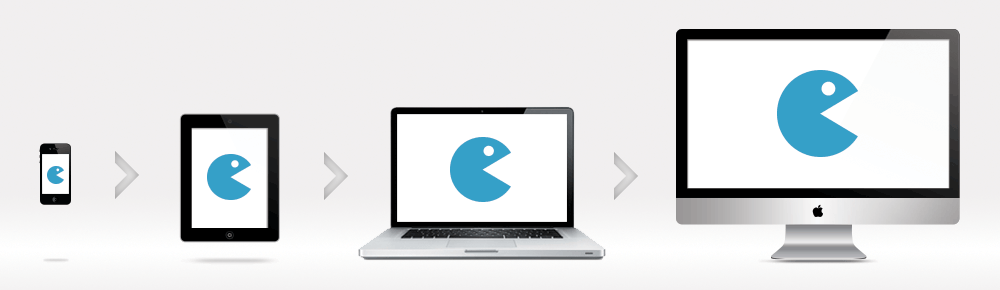
Aside from designing responsively, you need to keep the concept of mobile-first in your mind when designing for mobility. The mobile first approach, when designing responsively, helps in creating consistency and optimizing page performance. This is seen throughout the steady progression of tech and resolution from smaller to larger devices.
The mobile first approach helps alleviate clutter and unnecessary media and page elements by designing adaptively. This approach is gaining more and more attention as it provides a better alternative to having a main site and separate mobile site.
In fact, we at ZURB have hopped on board with the mobile first approach. We believe that building responsive mobile-first sites are going to become the standard practice among designers. Thus, we should firmly secure our hold and understanding now, as we can provide an excellent platform of support and expertise. With the introduction of Foundation 4, in the not so distant future, we plan on implementing mobile-first elements. By doing so, you will be able to create the most functional and progressively enhancing sites you can imagine.
“We’ve Got the Whole World, In Our Hands. We’ve Got the Whole Wide World…”
Mobility means much more than just having a web-accessible device in your pocket or bag. Mobility is about being able to use the web on those devices in the most efficient manner possible. Thankfully, the world understands the importance of responsive sites and beginning to realize the power of mobile-first design.
We, on the other hand, know just how important these concepts are for mobility and the users around the world. We are our products to help the designers of the world design better products for the users of the world. Mobility is here and it is certainly not going away anytime soon. So build for better mobile access.