Introduction to the Method
Rapidly test the usability of your designs
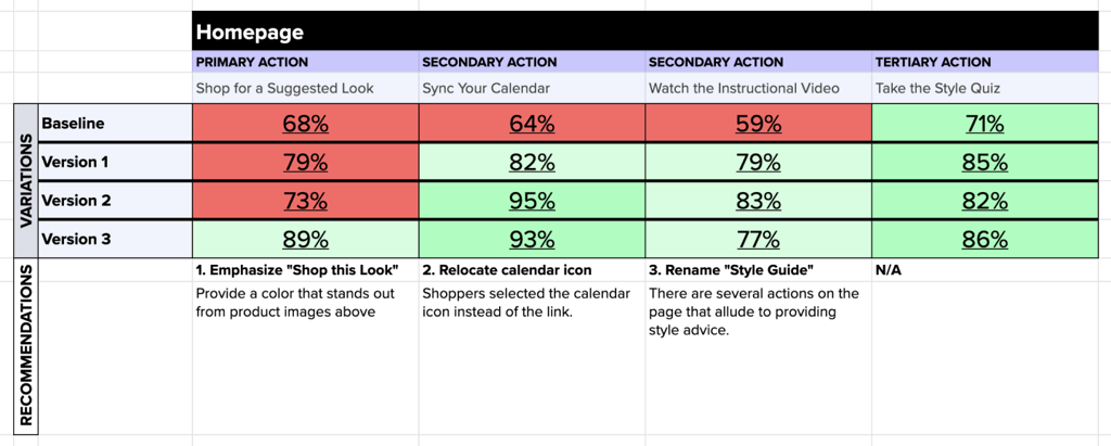
The image below shows a fully fleshed out Interaction Matrix, complete with 4 rounds of data and responses from over 1600 participants. Using Helio, we were able to collect that much data and work through 4 variations of a new design in a MATTER OF HOURS!

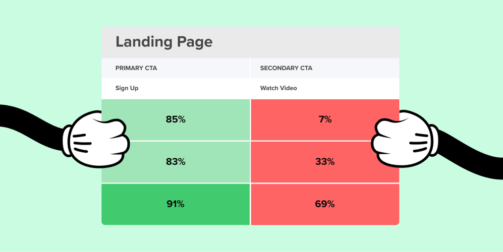
The Interaction Matrix is a method to track the usability of a website’s design. Helio’s remote surveys are used to test the usability of different actions on a web page, and the data is loaded into the Interaction Matrix to provide a big picture view of how participants interact with the designs.
The Interaction Matrix (IM) is best used to track usability of a page over several versions of a design. Gathering initial data will help you make the first tweaks, and the IM will give you a place to collect that data and track improvement (or regression) over time.
Helio can be used to gather multiple rounds of data, thousands of participant responses, for the Interaction Matrix in a matter of hours. Traditional usability tests are slow and require you to interpret long hours of recorded actions. Synthesizing your notes from these sessions can be daunting. But it doesn’t have to be that way. This is where the Matrix can kick your work into warp speed.
The Interaction Matrix is a powerful and intuitive tool for understanding the usability of different actions on your platform. You can swiftly evaluate hundreds of participants using qualitative and quantitative data. Learning this method to help make UI design improvements is well worth the time spent, for both designers and product managers alike.
The best part is, this is easily shareable with your team for making quick business decisions. The simple color coded key of the Matrix gives a high level look that even people who only take a glance can see results through the framework. Simply put, green is good!
We want you to be able to utilize this method for your own designs, so we’ve put together an example Interaction Matrix to test the usability of an eCommerce site we call Getup. To learn how to make your own Interaction Matrix, and our tips for selling the results to your team, continue reading below!


