Wireframing
A way to show clarity of purpose and function in a product.
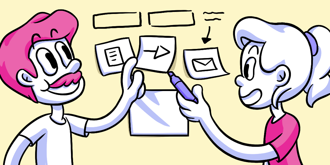
The nuts and bolts: Wireframing a web page layout is a way to show what interface elements will be present on key pages. It’s an important step in the interaction design process.
So, you have just set-up your web page using the tried and true GeoCities [RIP] create/host method (please tell us you have The Spice Girls’ “Wannabe” .midi file attached). But you really don’t like the functionality or presentation of your product. That’s where wireframes come into play. (Oh and we’re joking about using GeoCities. This is the 21st Century after all.)
To Wireframe, or Not to Wireframe: That is the Question.
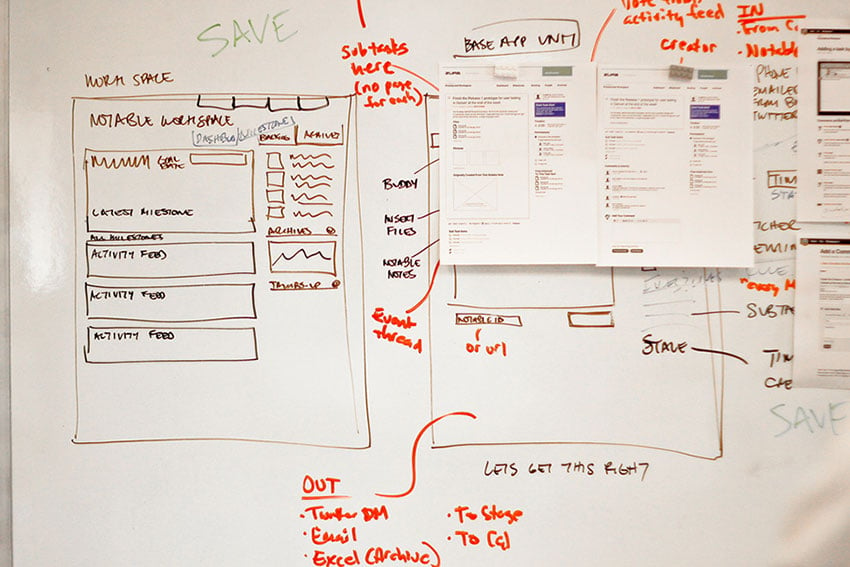
Many people debate whether or not wireframing is actually worth the time. Well, to further boggle your brain, the best answer is … there is no right or wrong. Some prefer to go old school, taking out a piece of paper and a Sharpie to wireframe. Others like to go new school with it, using a variety of tools to actually code up wireframes that we can actually click around on.
In short, wireframes are employed to help find problems with the functionality of a page or app, or they can be used to find opportunities and expand upon those successes.
Wireframes are your webpage schematics — blueprints, if you will. The wireframe is the barebones makeup of your, eventual, well-oiled machine. These wireframes are used to answer the question, “what is the screen supposed to do?” A wireframe’s focus isn’t on the beautification of aesthetic values. We want these wireframes to focus on the ease of use and functionality of a website.
An easy-to-digest list of why we love to create wireframes (more specifically the coded and static hi-fi wireframes that we craft with our Foundation framework due to its direct contextual representation of a final product) is as follows:
- We clarify a purpose
- We streamline a set of features, and create a focused, compelling way to communicate with users
We attack this list with the three elements of focus — Information Design, Navigation Design, and Interface Design — within wireframes.
Developing wireframes is as common as the common cold. Although, we occasionally have spirited discussions on whether to sketch out wireframes or to code them up first. In any case, there’s no specific data on “how common is common.” But rest assured, it’s common — about 2,200 wireframes a year common. It’s an integral step to creating a well-crafted, fine-tuned product.
In regards to the Design Process, wireframing comes during two phases, depending on the fidelity you’re choosing for your wireframe. Lo-Fi wireframes are found in the Ideate phase, where you’re coming up with a variety of ideas.
On the other hand, Hi-Fi wireframes are found in the Prototype phase. Prior to these two phases is the Define phase, or the discovery phase, where the page creator will reveal opportunities to help in further enhancing the usability of the site or app.
The main purpose of wireframes is to focus on three elements of design, as mentioned earlier — Information Design, Navigation Design, and Interface Design. This is to help create a landscape that is easy for users to navigate and understand.
The Triforce of Wireframe Elements
If you are an avid fan of Shigeru Miyamoto’s and Takashi Tezuka’s “The Legend of Zelda” franchise, you know the three pieces of the Triforce are made up of: Power, Wisdom, and Courage. When the three elements come together, it grants whoever holds the completed Triforce a wish. Wireframes have a triforce of their own — the three elements of design we listed above.
Each element is as integral to the overall design and layout as the other. When you bring all these elements together, your wireframe wish is already at your command. The users of your site shall be able to utilize your site with ease and find the functionality is flawless. Let’s break down each element.
Information Design
This element of wireframe design is primarily used to focus on clear communication of ideas and arrangement of content. We want the user to feel comfortable and at ease when looking at a page, and for the purpose of the user to accomplish specific goals and tasks. Without clear and concise presentation, how does one begin to understand what they are looking for, or what they are even looking at for that matter? We don’t want a website to look like a Pollock do we?
Navigation Design
The element of navigation design focuses on how users move from page-to-page and the connectivity between links. Without a proper roadmap, the user could become lost in a figurative (and literal) Internet rabbit hole. If you do not connect the roads, how do you expect people to visit?
Interface Design
This step may also be looked at as the Interaction Design. This is where you will find the most opportunities for added success with a page. This design aspect focuses on the tiny, yet crucial, elements found on web pages that simplify a user’s behavior on a site. Interface or interaction items, include but are not limited to: drop-down menus and text fields. Without the necessary tools, how could we piece together those immense Ikea projects?
Lo-Fi or Hi-Fi?
This isn’t pertaining to being an audiophile. Here, we are talking about how wireframes are created for presentational purposes. Where most wireframes are typically built with primitive tools (read: pen/marker and paper/whiteboard), sometimes there are more complex and intricate working prototype wireframes.
Lo-Fi
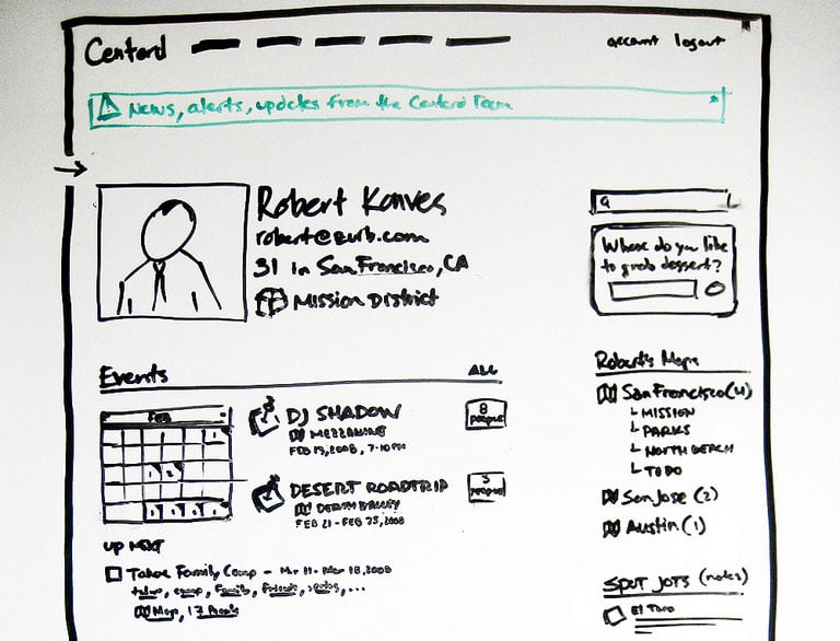
As noted earlier, most wireframes are created in this manner. This is the quick and easy transposition of a final product. A simple sketching of the product is the most widely used wireframing method, as it can be reworked and retooled with ease, without swimming through a myriad of coding. If need be, the sketches can be tossed away simply without hours of excruciating coding and working.
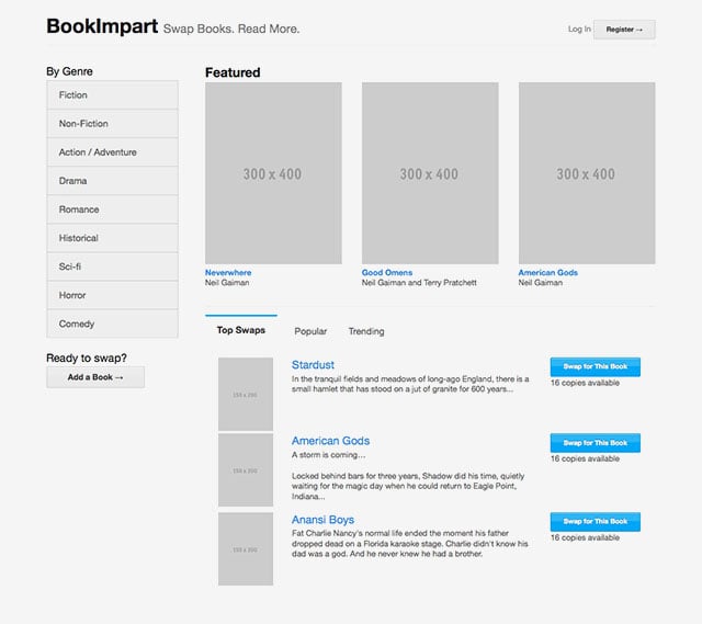
Lo-fis can also be represented as quick computer-drawn layouts, where content is often pictured as shapes (commonly squares and boxes) and text will generally be visualized in Lorem Ipsum. But phony Latin isn’t the perfect substitution for actual content. The words on the page are equally as important as the overall presentation of the material. They are not separate but equal entities — they are equal across the board. There’s where directive text is more useful than Lorem Ipsum.
However, with the simplicity of Lo-Fi wireframes comes some downfalls. There is not enough evidence on how the flow of the site actually feels, the context of the presentation is completely wrong. With the countless devices and screen sizes people use these days, it is hard to say how the product will be viewed.
Hi-Fi
These types of wireframes incorporate as much detail as possible to mirror the final product as possible. The wireframes can either be quick snapshots of what the page will look like, or they can be fully-functioning prototypes — Static Wireframes or Coded Wireframes, respectively.
Static Wireframe
The Static Wireframe gives a quick glimpse at how the page will be functioning by creating an image file of a mock up page. The program Omnigraffle helps with setting up this type of wireframe. The only drawback to this wireframe is that the page doesn’t have any functionality — it’s just a static image.
We found a way to make a “clickable” static image to fix the static purgatory that these wireframes sat in with the help of our Solidify app. On the other side of this issue, the creator will not be bogged down with coding and the time to create a coded wireframe.
Coded Wireframe
These types of wireframes are often produced with software to incorporate as much front-end web technology to showcase and test interactivity elements. These types of “coded wireframes” are becoming more and more the standard of practice thanks to prototyping tools, such as our favorite, Foundation. Though these wireframes are the most accurate in context and the best to view the functionality of a page, the time to create these functioning wireframes is much increased, as opposed to a quick image file.
We have a penchant for coded wireframes and with ever increasing ease to build them, why not? As with Lo-Fi’s setbacks, the Hi-Fi method is able to correct all the problems. You can view your page in the wireframe the way it is supposed to be seen in a real world context. You can feel the page in your wireframe the way it is supposed to be felt in the real world context. The ease of building these wireframes with programs and apps like: Foundation, Omnigraffle and Figma.
Take Figma, for example, which allows you to actually make your wireframes clickable, allowing a user to get a better sense of the functionality of your designs. Foundation, as well, allows you to create coded wireframes where you can easily move into prototype and finished product. It’s a no-brainer that you should delve into Hi-Fi wireframes, especially with these types of tools available.
Do What Suits You
We’ve laid out some basic guidelines for how these wireframes are structured and crafted. But whether you grab your laptop or break out your Sharpie will depend on a variety of factors, including the type of project you’re working on. In any case, wireframing is a good place to start drafting up your revolutionary site, whether you’re selling Blue Milk or creating a new social app.
Wireframes are your guide to developing the best gateway for users to reach your product.


