Research Study
Advent Navigation Tree Testing
Using tree testing to validate navigation changes for an ad management company

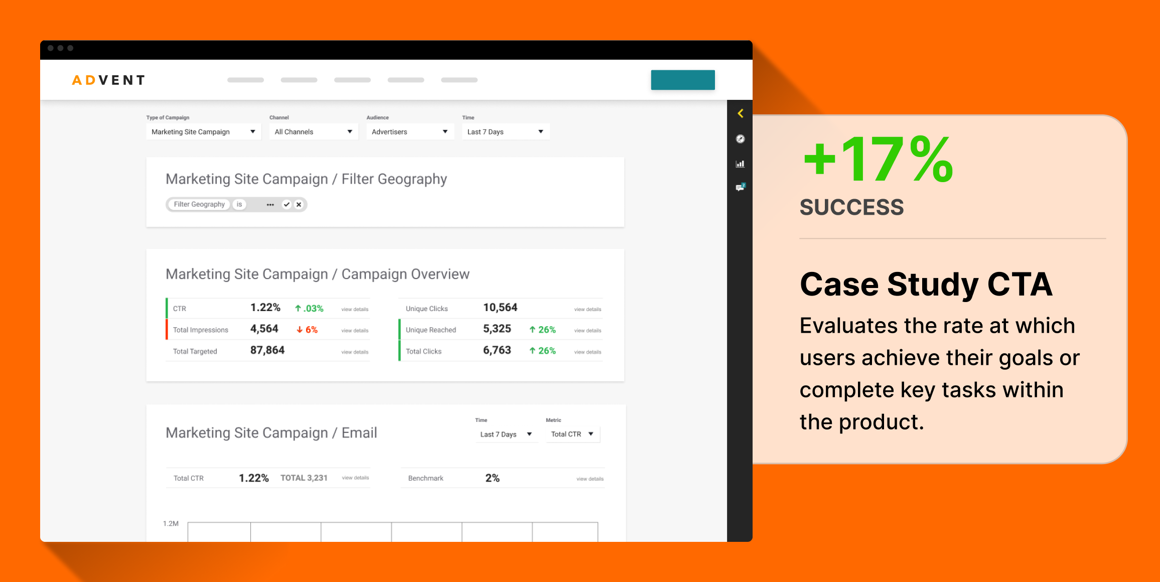
Advent needs more engagement on their case studies
Team proposed to move them from the current Services menu to a new Portfolio menu in their top navigation.
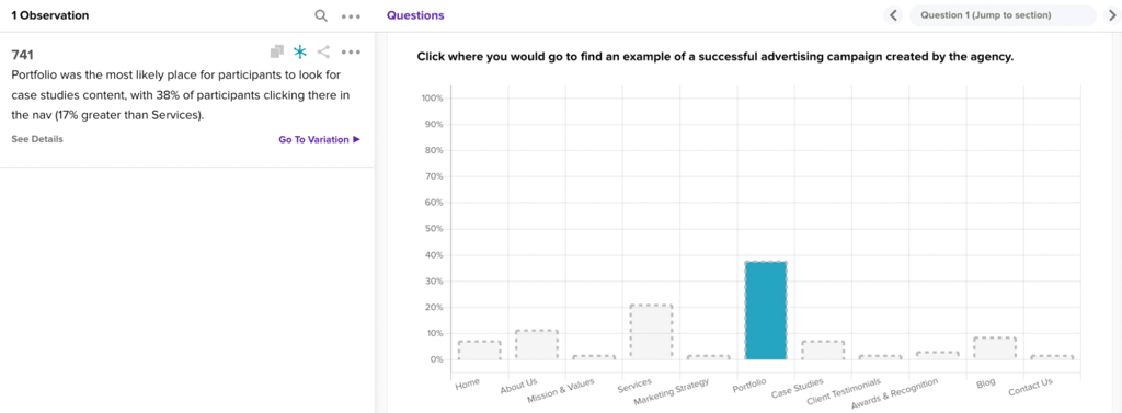
38% of participants expect case studies to live under Portfolio
Tree testing revealed that the majority of participants would look under click under Portfolio to find case studies.
Visitors are 17% more likely to look under Portfolio rather than Services
Services was the next most likely place for participants to look for case studies at 21%.
Business Challenge
Advent, an ad campaign management company, faced challenges with its website navigation, potentially affecting the discoverability of key content such as successful advertising campaigns and case studies. The primary issue was the unclear categorization of content under the existing navigation tab Services, which may have led to user confusion and reduced engagement.
Timeline
Over the course of 24 hours, the Advent team was able to provide their hunch about a new navigation menu for case studies, and collect 70 responses on a survey from their audience of advertising professionals.
Research Goals
The research aimed to:
- Evaluate the effectiveness of current navigation in leading users to important content.
- Identify the most intuitive placement for case studies and advertising campaign examples on the website.
Methodology
Helio employed a tree testing methodology to evaluate different navigation structures. This method involved testing both the existing navigation setup and proposed changes to determine the most intuitive user experience.
Research Panel
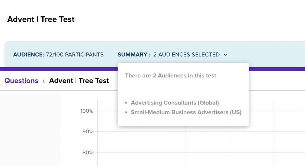
Advent tapped into Helio’s audience of advertising professionals at small-medium sized business across the globe:
Test Setup
Participants were provided a Tree Test in Helio, which mimics the Advent team’s proposed navigation hierarchy:
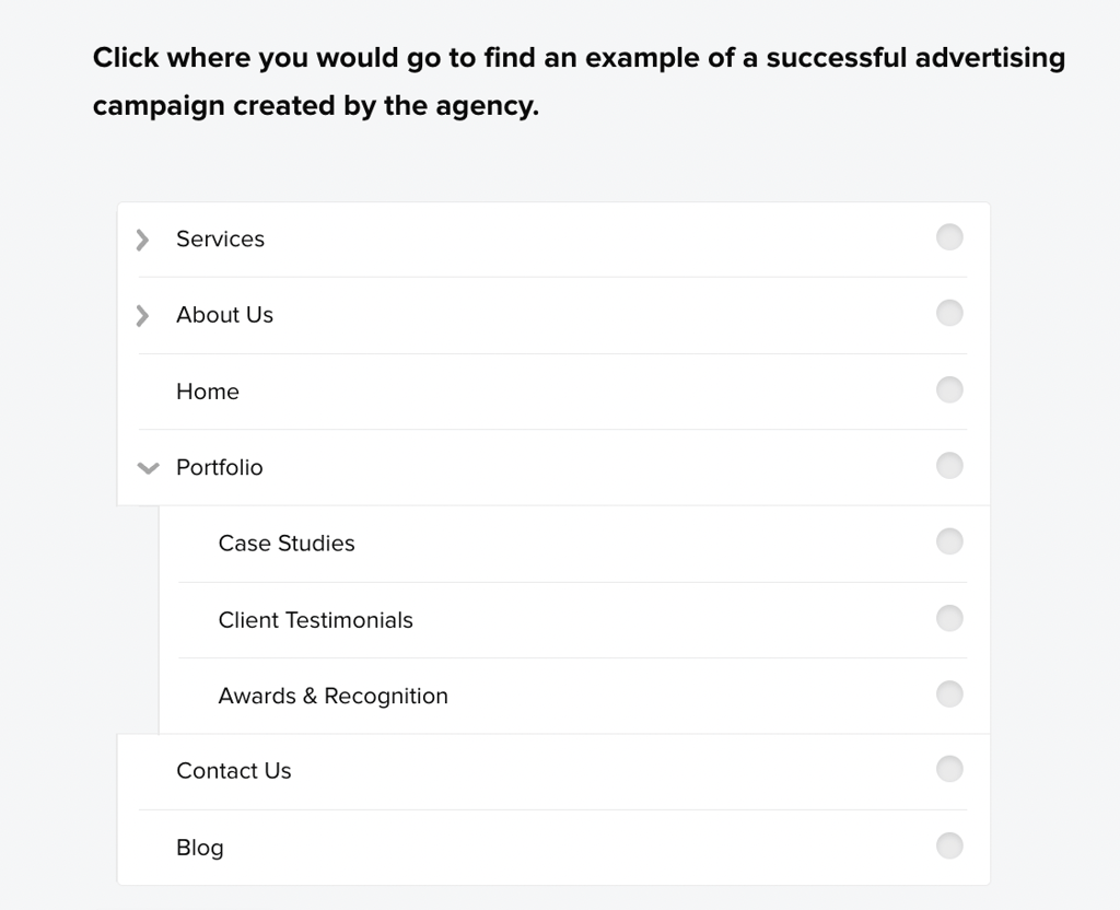
Participants were allowed to click on either top level categories or subcategories in order to answer the question.
Analysis and synthesis
38% of participants expect case studies to live under Portfolio
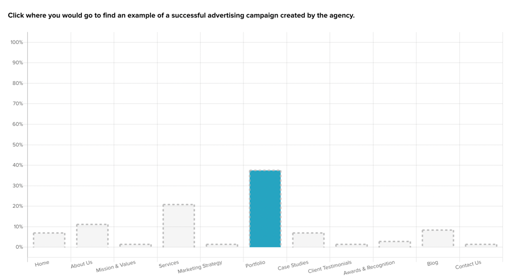
Tree testing revealed that the majority of participants would look under click under Portfolio to find case studies.
Visitors are 17% more likely to look under Portfolio rather than Services
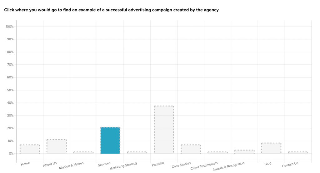
Services was the next most likely place for participants to look for case studies at 21%.
Outputs/Deliverables
Advent’s test results are collected in Helio’s data report:
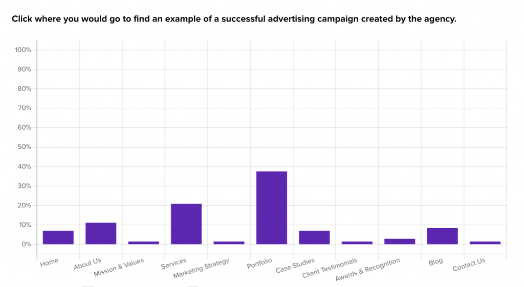
The Advent team was able to create Observations connected to specific data points that led to their findings:
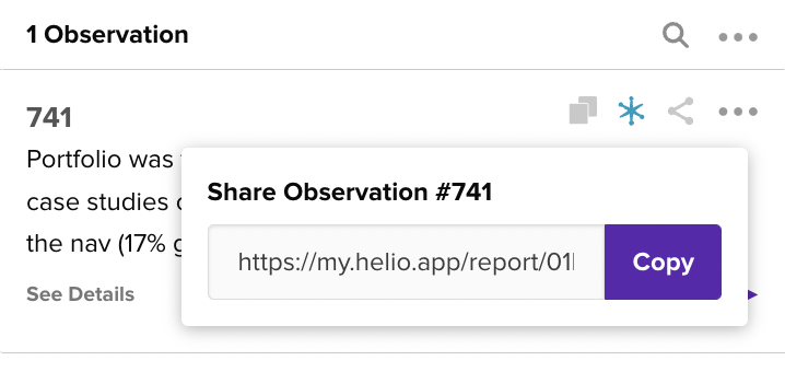
These Observations can be shared with the Advent team so that they can see the data that led to the decisions made on their navigation:
Next Steps and Recommendations
Following the study, recommendations were made to:
- Implement the “Portfolio” tab across the website.
- Continuously monitor user interaction with the new navigation structure through analytics.
- Consider further refinement of other underperforming navigation links based on user feedback and ongoing testing.
Reflections
This case study highlighted the importance of aligning website structure with user expectations and behaviors. It demonstrated that even small changes in navigation could significantly impact content discoverability and user engagement. The project also underscored the value of using specific user testing methods like tree testing to gather actionable insights for website optimization.
