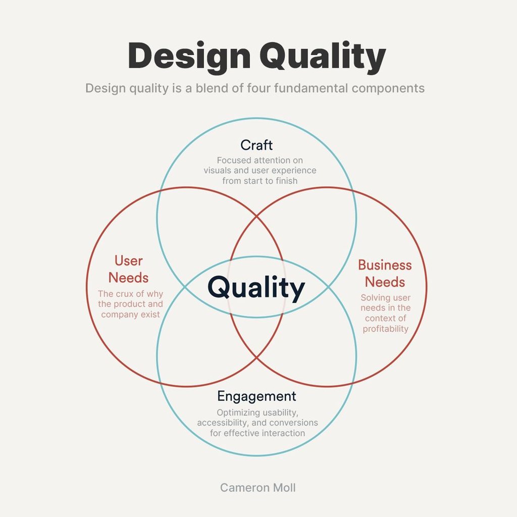
Design quality is more than just how good something looks. It’s about how well it works, meets users’ needs, and helps a business succeed. According to design leader Cameron Moll, true design quality comes from a perfect mix of four key elements: craft, user needs, business needs, and engagement. This balanced approach ensures that design doesn’t just look good—it works for people and companies that create products.
Each part of this mix plays an important role. Craft is about paying careful attention to details, from the first sketch to the final product. User Needs focus on what people want and need from a product. Business Needs is how a product can be profitable and successful. Finally, engagement looks at how people interact with the product—how easy and enjoyable it is.
Understanding and mastering these elements can make you a better design leader and set your work apart. Whether you are an experienced designer or just starting to lead a team, focusing on high-quality design can make a big difference. Let’s dive into these components to see how you can use them to make designs that look great, work beautifully, and meet real needs.
Understanding Design Quality
When we talk about “design quality,” we’re diving into how effectively a design meets its intended purpose and how well it satisfies the users and the business it serves. Quality in design isn’t just about making something that looks good—it’s about creating something that works well in the real world.
What is Design Quality?
Design quality measures how well a product’s design achieves excellence across usability, aesthetics, functionality, and sustainability. A high-quality design appeals visually, performs its functions superbly, meets users’ expectations, and integrates smoothly into a business model.
Why is Design Quality Important?
In a market filled with countless products and fierce competition, a design that stands out for its quality can make a significant difference. It can attract more customers, create a stronger brand reputation, and improve customer satisfaction. Businesses prioritizing design quality see more success and longevity because they resonate more deeply with their users.
The Four Fundamental Components of Design Quality
- Craft: This involves the detailed attention designers give to every aspect of a product, from its initial concept to the final touches. Good craft ensures the product looks appealing, feels well-made, and operates seamlessly.
- User Needs: Understanding and addressing users’ real needs and desires is crucial. A design that aligns with these will be more successful and appreciated.
- Business Needs: Design must also align with business goals like profitability and market relevance. High-quality design balances meeting user needs and benefiting the business financially.
- Engagement: This focuses on how users interact with the product. Good design promotes easy use, accessibility, and enjoyable interactions, which can lead to higher conversion rates and customer loyalty.
By focusing on these four components, designers and design leaders can ensure their products achieve high design quality. This boosts the product’s success and enhances the overall user experience, fostering a positive relationship between the user and the brand. Next, we’ll explore each of these components in more detail, giving you practical tips on how to apply them to your design projects.
Deep Dive into the Four Components of Design Quality
To truly grasp design quality, it’s crucial to understand and effectively implement its four fundamental components. Each element contributes to the overall excellence of a design. Let’s break down these components further:
Craft
Craft is all about the attention to detail in every stage of the design process. From the early sketches to the final product, every detail matters. High-quality craft means everything is well-thought-out, from the choice of colors and fonts to how buttons function on a screen. To enhance your craft:
- Regularly review and refine every aspect of your design.
- Use feedback from users to make improvements.
- Ensure that the final product is not only functional but also aesthetically pleasing.
Collect qualitative feedback on visual design, wording, and overall branding from a wide audience to ensure the design resonates well with the target market. Facilitate iterative testing, allowing designers to refine their iterations based on real user feedback from initial concepts to final refinements.
An Example Using Helio
Indiana University’s online team saw an opportunity to update its brand imagery to align with its audience of remote, at-home students. IU Online’s current imagery was carried over from pre-COVID days and heavily emphasized the physical IU campus.
The IU Online team aimed to more closely align their site imagery to the lifestyles and preferences of their remote student base. The goal was to establish a baseline for brand impressions towards the current imagery and then determine a variation that outperformed the baseline regarding positive emotional reactions and relevance. Starting with three variations of brand imagery options, each was put to the test for satisfaction and emotional impressions with a different group of 100 participants:

Each variation of brand imagery was spread throughout content sections on the current IU Online homepage to gather reactions from participants in a live-site scenario:
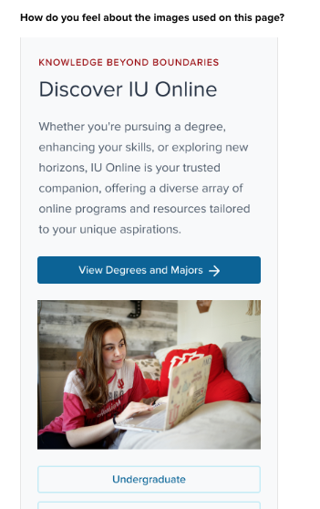
As most of their incoming traffic is on mobile devices, we tested the brand imagery in a mobile setting to provide the most accurate context to participants.
Helio Testing Results
Once the results were collected across each variation, the data was loaded into a comparison framework for quick analysis:
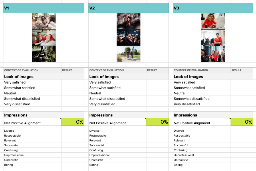
With responses from 100 participants on each variation of brand imagery, the data was loaded into the comparison framework for a bird-eye view of user reactions:
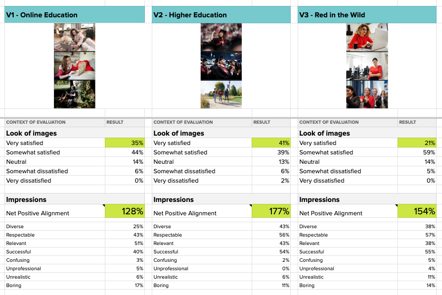
We found that V2 produced the most positive impressions and levels of satisfaction while avoiding the boringness and skepticism of the other themes.
One of the most interesting observations was that the Online Education theme of V1, which the team thought might align well with an audience of remote classtakers, did score highest in terms of relevance to participants:
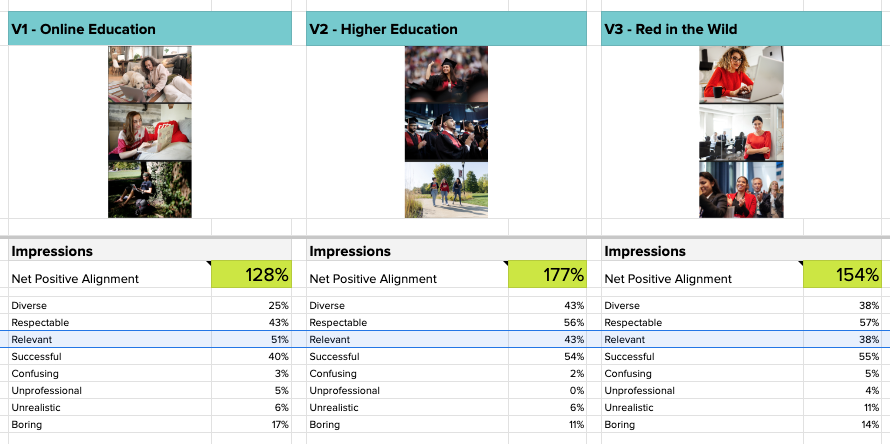
However, the Online Education theme produced the lowest amount of positive impressions from participants, suffering from a lack of showing success and respectability.
“No one is in classes or doing anything exciting, they are just sitting at home doing homework”
– Undergraduate Student (US)
On the other hand, the Higher Education theme was able to impress upon visitors the sense of accomplishment that the team determined to be more valuable than relevance:
“All images are pertaining to university life and graduation and feeling like one has successfully achieved their goal”
– Graduate Student (US)
The IU Online team moved forward with validation that their Higher Education theme would produce the most positive impressions from visitors to their site.
User Needs
Meeting user needs is at the heart of successful design. If a design doesn’t resonate with its intended audience, it won’t succeed, no matter how good it looks. To align your design with user needs:
- Conduct user research to understand what your audience truly wants and needs.
- Test your designs with real users to gather feedback and make necessary adjustments.
- Always consider the user’s experience and strive to solve their problems through your design.
Using Helio:
Conduct surveys and gather feedback better to understand their users’ actual needs and desires, ensuring that the products are developed with a user-centric approach. Validate assumptions about user needs and preferences, guiding product development to better align with users’ true needs.
A big part of IU Online’s strategy was preparing for a mobile-first design since most site traffic comes through mobile devices. The team tested their designs in a mobile context, such as the crucial Apply page that introduces visitors to the application flow.

Variations
We whipped up 7 variations of the apply page to evaluate different approaches to presenting the necessary information. The baseline design was very sparse, so our new variations focused on bringing more educational and visual elements to the page, such as imagery at the top and a bulleted list of the steps within the application process.
We tested these 7 variations of the apply page against the current baseline by asking participants how they feel about the page and then gauging whether that influences their expectations of the upcoming application flow.
The data from our college student audience was then pulled into a comparison framework for easy analysis of the different versions.
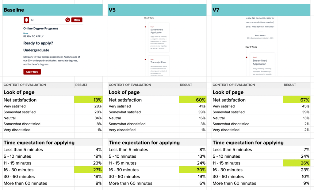
We found that incorporating a student testimonial, educational imagery, and a bulleted list of application steps improves expectations of the upcoming application. As seen in the data above, the latest versions of the page, V5, and V7, tested significantly better than the baseline. The increase in satisfaction from as low as 13% to upwards of 67% is dramatic and even produced more participants who believe the application process will take less than 15 minutes.
Business Needs
While meeting user needs is important, a design must also fulfill business objectives to be considered high-quality. This includes being cost-effective, enhancing brand reputation, and contributing to business growth. To balance user and business needs:
- Identify key business goals that your design needs to support.
- Design with scalability and market demands in mind.
- Measure the impact of your design on business outcomes, such as increased sales or improved customer engagement.
Using Helio:
Measure and analyze how well a product’s features are aligned with business objectives, such as profitability and market penetration. Test different business models or pricing strategies in a controlled environment, gathering data on what maximizes profitability while still satisfying user needs.
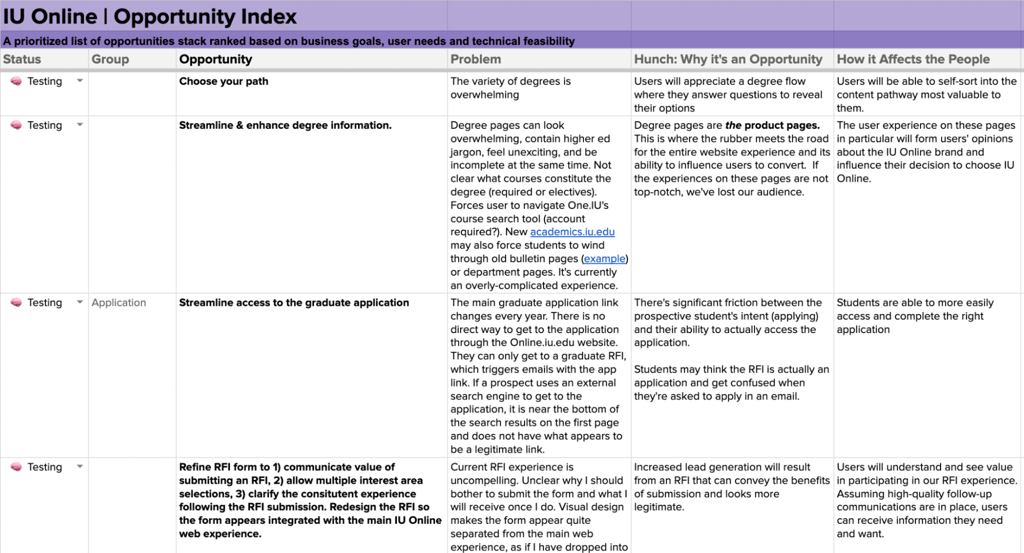
To ensure their business needs were being addressed, we helped the Indiana University team develop an Opportunity Index to collect their ideas and then prioritize those concepts. Each opportunity that the team added to the index is accompanied by a description of the problem it’s solving, what exactly is the opportunity provided, and how it affects the end users:
Opportunities
Once the team’s ideas were down on ‘paper,’ we set to work determining the priority of each opportunity for the team. This was done by providing a 1 – 5 value for each opportunity in 3 columns: business value, user value, and technical feasibility.
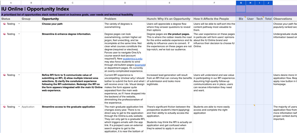
The ratings in the user column are provided through our user needs testing, which we expanded on above. Tech feasibility is determined by the technical experts on the IU Online team, and business value is provided by the top-level stakeholders of the project:
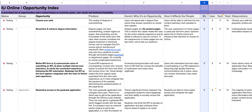
With this process in place, the team was able to see a 1 – 15 rating for each of the opportunities they had provided and then reorder those opportunities to tackle the highest-value ideas first. This ensured that Indiana University’s business needs were accounted for in each of the ideas that their team produced, and only the ideas with high ratings across each of the three values would make it through to production.
Engagement
Engagement refers to how users interact with the design. A high-quality design is easy to use, accessible, and enjoyable, keeping users returning. To improve engagement:
- Focus on usability to ensure your design is easy for everyone to use.
- Enhance accessibility by considering the needs of people with disabilities.
- Optimize the user interface to make interactions smooth and enjoyable.
Using Helio:
Test different user interfaces and interaction models to assess their effectiveness and ease of use, helping to refine usability. Enable testing for diverse user groups to ensure the product is helpful to all potential users. Conversion rates can be optimized by experimenting with different calls to action or page layouts and measuring which variations perform the best.
By mastering these four components, you can significantly elevate the quality of your designs. This approach will make your products more appealing and effective and ensure they stand out in a competitive marketplace.
In the next section, We’ll explore strategies design leaders can use to foster an environment where high-quality design flourishes.
A search testing example
Indiana University redesigned its website, and one key experience they wanted to improve was searching for and finding relevant degrees. IU’s current degree index page badly needed an update, and one of the team’s ideas was to prioritize how features are displayed on the degree listing page rather than maintaining the current alphabetical order.
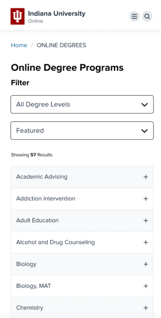
The Indiana University team’s goal was to encourage the exploration of different degrees on the index page and increase engagement with 10 of their key school programs.
One hundred participants from IU’s audience of undergrad and grad students interacted with each version of the page, answering the same questions to compare their responses across variations. Once the data had been collected, the responses were copied into a data comparison framework for quick design evaluation.

Once the data had been collected and loaded into the comparison framework, the picture of how users reacted to each different version became more clear:
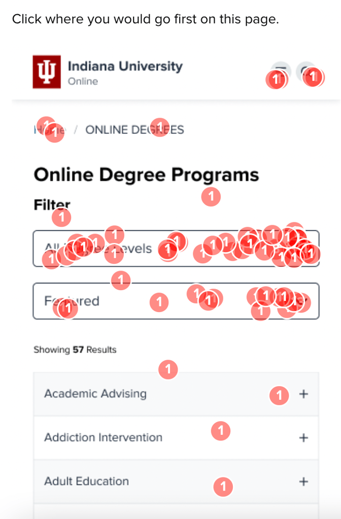
In the current page version, with the degrees in alphabetical order, only 7% of participants engaged with the list, instead opting to go directly to the filters and search bar.
When the degrees list was reorganized to show featured degrees up top, engagement with the list jumped to 19-24%, showing a desire to interact with the page rather than resort to the search features.
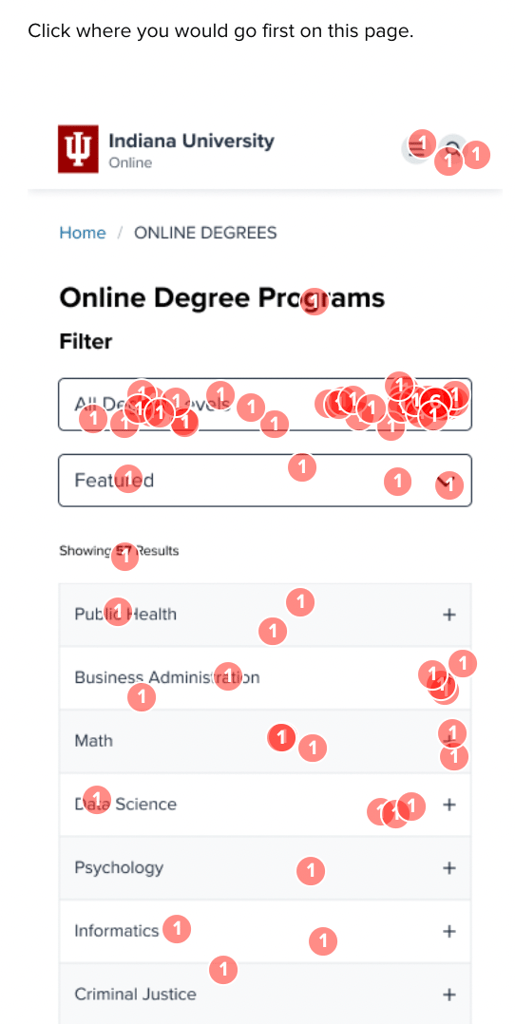

The versions where we tried out highlights in the degrees list both reduced satisfaction with the look of the page (V2), and reduced engagement on the list when hidden under a dropdown (V3). The team decided to move forward simply with the idea of re-ordering the degree list without trying to introduce visual highlights.
This type of engagement testing, along with the others we used to hone IU’s craft toward user and business needs, was integral in redesigning Indiana University’s website, which produced an up to 80% increase in site applications.
Strategies for Design Leaders to Enhance Quality
Understanding and implementing strategies that drive design quality is essential for design leaders aiming to elevate their teams and projects. Here’s how you can foster a culture of excellence in design within your organization:
Encourage Continuous Learning and Improvement
Design trends and technologies evolve rapidly. Encourage your team to stay updated with the latest design practices and tools. This could be through workshops, webinars, or courses. A team that continually improves its skills will naturally produce higher-quality designs.
Inspired by Marina Krutchinsky‘s list of underrated UX skills, we compiled a list demonstrating how continuous discovery can enhance your team’s underrated UX skills. By prioritizing customer and user needs, we shift the focus in reviews and meetings away from the “Highest Paid Person’s Opinion” (HiPPO) and towards more user-centered discussions.
Foster a Collaborative Environment
Great designs often come from collaborative efforts. Encourage your team to share ideas, feedback, and insights with each other. This open dialogue can lead to innovative solutions and improvements in design quality.
Set Clear Objectives and Expectations
Clearly define what design quality means for your team and projects. Set specific, measurable goals for aesthetics, usability, and user engagement. When everyone knows what’s expected, they can more effectively align their efforts toward achieving high quality.
Implement User-Centered Design Practices
Always center the user in the design process. This means regularly gathering user feedback using UXR, testing designs with real users, and making decisions based on this data. When your design decisions are informed by user needs and behaviors, the quality of your outcomes will improve.
Optimize Workflow and Tools
Use the best tools and technologies available to enhance design quality. Also, streamline your design processes to eliminate unnecessary steps and focus more on quality-critical activities.
Celebrate and Recognize Quality Achievements
When your team achieves high quality in a design, celebrate it. Recognizing and rewarding great work motivates the team and sets a benchmark for quality. This boosts morale and pushes everyone to achieve high standards in future projects.
By adopting these strategies, design leaders can create an environment where high-quality design is the norm. Implementing these practices will improve the design outputs and enhance your team’s productivity and creativity. In the next section, we’ll look at practical tools and resources that can further support your quest for design quality.
Practical Tools and Resources for Design Quality
You must equip yourself and your team with the tools and resources to achieve and maintain high design quality. These can streamline processes, gather and analyze user feedback, and enhance the overall design elements.
Here’s a list of practical tools and resources that we use in our tech stack can boost your design quality:
- Figma is excellent for team collaboration, allowing multiple designers to work on the same project in real time. It’s very effective for UI/UX projects.
- Helio is perfect for targeted surveys and feedback. It helps you understand user preferences and validate design decisions based on user data.
- Jira is particularly useful in agile software development. It includes features that support planning, tracking, and managing agile software development projects.
- Notion is an all-in-one workspace for note-taking, data management, project management, and collaboration. It’s especially helpful for organizing design resources, project documentation, and timelines.
- Google Slides: A straightforward tool for creating presentations, ideal for sharing design concepts and visual stories with stakeholders and team members.
Overcoming Challenges in Achieving Design Quality
Achieving high design quality consistently can be challenging, especially in a fast-paced design industry. Here are some common obstacles design leaders might face and strategies to overcome them:
Handling Team Dynamics
Working with diverse personalities and skill sets can sometimes lead to conflicts or misalignment in goals. To handle this:
- Foster Open Communication: Encourage your team to share their ideas and concerns openly without fear of judgment. This helps resolve conflicts and align goals.
- Set Clear Roles and Responsibilities: Make sure everyone knows their role and what is expected of them. This clarity reduces confusion and overlaps in responsibilities.
Balancing Creativity and Usability
Designers often face balancing innovative, creative ideas with practical, user-friendly solutions. To balance creativity and usability:
- Iterative Design Process: Use an iterative process where you prototype, test, and refine designs based on user feedback. This ensures that creative ideas are also practical and user-centric.
- Regular User Testing: Make user testing a regular part of your design process. This allows you to see how real users interact with your designs and make adjustments as needed.
Managing Client Expectations
Clients may have expectations that are difficult to meet with the resources or time available. To manage client expectations effectively:
- Clear Communication from the Start: Be clear about what is feasible within the given constraints right from the beginning. This prevents misunderstandings later on.
- Regular Updates: Keep your clients updated regularly about the project’s progress. This helps manage expectations and allows for adjustments in case of misalignments.
Ensuring Consistency in Design Quality
Maintaining a consistent level of design quality across all projects can be tough, especially under tight deadlines. To ensure consistency:
- Standardize Design Processes: Develop and adhere to a standard set of design processes and checklists. This ensures that every project meets a certain quality standard.
- Quality Control Reviews: Implement regular quality control reviews to evaluate designs against set quality criteria. This helps maintain a high standard across all projects.
By tackling these challenges head-on and implementing effective strategies, design leaders can ensure their teams consistently deliver high-quality designs. This enhances user satisfaction, strengthens the brand, and supports business goals.
Design Quality FAQ
Design quality refers to the effectiveness of a design in fulfilling its intended purpose while meeting the needs of users and the business. It is a holistic concept that spans usability, aesthetics, functionality, and sustainability. High-quality design looks appealing, functions efficiently, meets user expectations, and fits well within a business model.
In a competitive market filled with numerous products, design quality can significantly distinguish a product and enhance its appeal. High-quality designs tend to attract more customers, build stronger brand reputations, and increase customer satisfaction. Businesses prioritizing design quality often enjoy greater success and sustainability as their products resonate more deeply with users.
To improve the craft of your design, focus on meticulous attention to every detail, from the initial concept to the final touches. Regularly review and refine every aspect of your design, use user feedback to make necessary improvements, and ensure your final product is functional and aesthetically pleasing. This dedication to craft will significantly enhance the overall quality of your designs.
To effectively meet user needs, conduct thorough user research to understand what your audience truly needs and desires. Incorporate regular user testing into your design process to gather feedback and make necessary adjustments. Always prioritize the user’s experience and aim to solve their problems through thoughtful design, ensuring your products are user-centric and relevant.
Balancing user needs with business needs involves designing with the user’s satisfaction and the company’s financial goals in mind. Identify the key business objectives that your design must support, such as profitability and market reach. Design with scalability in mind and measure the impact of your design on business outcomes to ensure it contributes positively to the company’s goals.
User engagement through design can be enhanced by focusing on usability, accessibility, and pleasant interactions. Ensure your designs are easy for everyone to use and accessible to people with disabilities. Optimize the user interface to ensure smooth and enjoyable interactions, which can lead to higher conversion rates and foster customer loyalty.
Common challenges in achieving high design quality include keeping up with rapid industry changes, balancing creativity with usability, and managing client expectations. Overcome these by investing in continuous learning for your team, using an iterative design process for creativity and usability, and maintaining clear communication with clients about project feasibility and progress. Regularly update your processes and tools to ensure consistency in quality across all projects.

